Happy Hour at the Beach

It’s Sneak Peek week for Karen Burniston’s February 2023 release!

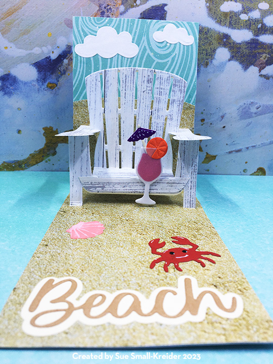
Every hour is happy hour at the beach is the sentiment of this mini-slimline card. It uses the new beach themed dies from Karen Burniston’s February 2023 release including Beach Borders, Word Set 16 – Beach Happy Hour, and Sea Charms.

I started with a 3.5-inch by 11-inch rectangle and folded the card at 6-inches to make a 3.5×6-inch top-fold card base.

Watch assembly video before die cutting the Adirondack Chair into the card base. I marked on the backside of the sand print paper (3.5×8.5-inches) where slits need to be cut to cover the background where the chair is cut from the cardstock. (I cut the top edge of the sand print paper with a wavy sand dune vibe.) Adhere the sky-blue paper at the top of inside of the card base above chair. Slip the sand print paper with slits into place and glue.

Die-cut the chair again from wood gran cardstock making sure the grain goes from top to bottom of the chair and armrests. Cut just the seat of the chair with the woodgrain going sideways the length of the boards. Glue the woodgrain pieces onto the card base chair.

Adhere the ocean wave paper (3.5x11inch) to the outside of the card base. Die-cut sentiments from the new Happy Hour word set and assemble. (I cut the Happy Hour twice in different pinks.) Layout the words on the front of the folded card base before adhering.

The shell and crab elements are from the new Sea Charms set while the fruity drink is from the previously released Happy Hour Charms set. I used a thin foam square cut in half to adhere the drink to the chair.

I find it fun to decorate the backs of cards with something small and whimsical. The jelly fish charm from the Sea Charms is cut from vellum and glued over a purple stenciled body.

Thank you for reading this blog post. I hope it inspires you and makes you smile. Please like and leave comments 😊

SEE other pop-up SEATING blog posts by clicking here.

Materials Used:

Dies

Papers

  • Park Lane Paperie – 12×12 Printed Paper – Nautical
  • The Paper Studio – 8.5×11 Printed Paper – Sand Photo
  • Honey Bee Stamps – 6×8.5 Double-Sided Premium Cardstock – Grain and Grunge
  • Pink, Magenta, Red, Orange, Purple, Brown and White Cardstock Scraps
  • Clear Vellum
  • Light Weight Cream Cardstock

Pens & Inks

Miscellaneous

Enjoy The Waves At The Beach

It’s Sneak Peek week for Karen Burniston’s February 2023 release!

Standing in waist-high water at the beach letting the waves bounce you up and down is a fun childhood past-time. This card is reminiscent of those sunny, seashore visits. It uses a variety of new beach themed dies from Karen Burniston’s February 2023 release along with some new labels and frames that coordinated with the previously released Label Charm Pop-Up set.  This 3.5 x 8.5-inch card is a quick make and easily fits in a #10 business envelope. 

I started with a 3.5-inch by 8.5-inch rectangle and scored an additional 3.5-inch by 6-inch rectangle at .25-inch to form a tab along the short end. Glue this tab to the back of the large rectangle to form the card base.

Using double-sided tape, I covered the inside and outside panels with coordinating papers. (My favorite technique for using double-sided tape is to place around the edge of the card, lift the ends of the tape so corners are sticky, position the covering paper, you can shift the top paper a bit before you pull all the tape backing paper strips. See tutorial post)

Before I die-cut my Label Charm Pop-Up pivot panel into my card base, I watched the assembly video for the die and cut out the accompanying tabbed frame and label. I also cut out a large frame to edge the front aperture of the pivot panel.  I centered the pivot label charm pop-up die over the front of my card and die cut through all three layers of paper and cardstock. Because of its thickness, I ran it through my die cutting machine twice. 

Besides the frame, there are two additional labels that will fit inside the pivot panel and back tabbed label. For this card, I used the smallest of the new labels with the largest dotted border label from the original set.

Decorate the oval charm with shells from the new Sea Charms set. (I daubed a pale-yellow ink- Antique Linen on the oval charm and dotted with a gold gel pen to give the look of sand. Then I glued on stenciled shells to both sides of the oval charm.) Attach the decorated charm to the oval frame with a jump ring before assembling the pop-out elements of this card. (My jump ring had a rhinestone dangle.)

Fold the charm frame and attached label together as they will go into the card. Place a drop of glue on the frame’s tab and adhere to the back side of the card front label. Glue the blue label to the inside card back panel.

To decorate the card, I used the dancing tiny crabs from the new Beach Borders set. There are eye holes in the die that make it easy to take a white gel pen to stencil in the eyes. I added mouths for fun.

“Enjoy the Waves” come from a coordinating sentiment strip in the paper pad. “At the Beach” is die cut using the new Word Set 16 -Beach Happy Hour.

As with all my cards that are sent in an envelope, I have decorated the back flap with some dancing blue crabs to hint at what’s inside. This is #10 business envelope.

Thank you for reading this blog post. I hope this inspires you and makes you smile. Please like and leave comments 😊

Materials Used:

Dies

Papers

  • Park Lane Paperie – 12×12 Printed Cardstock – Nautical
  • Fun Stampers Journey – 8.5 x 11 Card Stock – Pumpkin Bread
  • Navy Blue and White cardstock scraps
  • Light weight white cardstock
  • #10 Business Envelope – Craft Paper

Pens & Inks

Miscellaneous

Mountain Train Ride

There is nothing so relaxing as a train ride through the mountains. Seeing the pine trees at the higher elevations and the babbling streams in the gullies. Hearing the chug-chug-chugging of the steam engine and experiencing the darkness of a mountain tunnel coming back into the sunlight.

In my challenge to myself to see how many different themed cards I can make with Karen Burniston’s new Fireplace die set; I decided on a mountain train tunnel with the mouth of the tunnel using the fireplace mechanism’s opening. All the dies used are by Karen Burniston.

I had made multiple train cars and engines for an earlier project. (Watch the assembly video for the trains.) The train tracks are from a train elements set and I cut 4 of them to have enough pieces to form the track I needed for the front and inside of the card. For the smoke from the smokestack, I turned the smallest cloud from the Outdoor Scene set on its side and glued inside the stack.

The front of the card uses curving hillside with large pine trees from the Outdoor Scene set and the treeless curving stitched edger from the Long Nature Edges set for the foothills. I shaded the hillside tope edges with a pale brown ink.

For the card’s sentiment, I double cut the large words “Enjoy” and “ride” once from brown and again from black so that I could offset them to create a shadow. The oval cuts out the word “THE” so it is backed with a scrap of black.

The inside of the card requires some practice laying out to get the right placement of the mountains, so they won’t stick out of the card when closed. (Watch the fireplace assembly video before laying out and assembling.) I used scrap pieces of brown lightweight cardstock to cut my crosshatch ovals. (Largest oval die in set was used.) I cut off the bottom of the ovals to have varying heights. The largest oval I turned over on the back, traced the mechanism opening onto and then die-cut the opening using the second to smallest to fit inside the penciled opening.

The smaller ovals are glued to the sides and behind the oval with the tunnel opening. I then adhered the fireplace mechanism as shown in assembly video and glued the mountains onto mechanism matching up the openings. Next, I pieced together the train tracks to come out of the tunnel and near the side of the mountains. Using the pop-up strip from the Fireplace die set and the two angled pop-ups from the Mini Pops set, played with placement of the pop-ups with the train pieces to set spacing.  Glue the pop-ups first and once their glue has set, then adhere the train pieces. (I bent the pop-ups at their original scored folds, but you might play with other folds and or strips to get a more realistic alignment of the train cars.)

The babbling stream is created from strips of patterned paper cut with the Long Nature Edges curving stitched edger. The diagonal placement adds drama to the card and space in the corner to write a personal message.

Leftover pieces from the train track as well as pieces from other card projects complete the back of the card.

As is my habit, I decorated the envelope back flap with additional train pieces to hint at what’s inside.

Thank you for reading this blog post. Please like and leave comments 😊

Materials Used:

Dies

Papers

  • Colored, coated and glitter cardstock and patterned paper scraps
  • American Crafts – 5 x7 Kraft card & A7 envelope

Inks

  • Green fine-tipped marker
  • Ranger – Tim Holtz -Distress Ink – Antique Linen

Miscellaneous

Seaside Vacation

Seaside vacation - front

Need a break? Jump-into this vacation card and get away, hear the waves gentling coming ashore, the occasional seabird crying out overhead, smell the sea air and feel the grit of the sand beneath your feet.

This fun, A7 sized card came from my desire to make a nautical themed card from my stash of underwater, fishy, and nautical stamps, dies, papers and embossing folders. The papers and embossed/inked background came from one of early papercrafting magazines I purchased – Love Cardmaking issue 4 and its the “By the Shore” embossing folder, stamps and digi papers. I love these papers and have used them for to make a number of cards in years past. Two small stamp sets from Prima Marketing’s Seashore collection at some point made their way into my stash, but never used. Some new to me Stampin’ Up inkpads gave me the excuse to try stamping the small nautical stamps.

After pulling together all the various elements that I might use and having noticed a trend of shapes being layered askew on card fronts, I decided to try the trend. I played with the layout and began by gluing the blue background over the front and back of card. Next, I glued edges of inked embossing folder piece and trimmed off the overlaps that went off the edges. The top is wrapped over the fold and glued on the back.

Seaside vacation - front-cu

Using two different thicknesses of foam squares/dimenisionals, I adhered the stamped pieces to the front. The rectangular card needed somethings to hide the fact the rope border didn’t fully meet-up at the corners. In digging around in my elements caddy, I found some K & Company die-cut sea life images which were all too big for my purposes, but on the packaging were just the right size of images which I fussy cut and adhered to the rope corners. The addition of a puffy orange starfish and a foiled rising sun sticker and, voila, the front was finished.

I had one tiny multi-colored masked and stamped image with the word “Enjoy” which I glued inside the card.  The blue paper on the back of the card didn’t come completely down to the bottom edge so I pieced together a sandy beach to complete the card.

Seaside vacation -inside-envelope

The sailing ship was stamped in blue ink on the back of the envelope.