In-VEST

Being in-VESTED in parenthood is a huge commitment. I wanted to card to thank the fathers in my life who have invested their time and energy into being awesome Dads!

This card is completely die cut with a computer-generated sentiment (my spouse’s wording). Divinity Designs by Kelley Holland has come out with a bundle including the shirt, tie and vest as well as the fishing and hunting die set. What makes this bundle unique is the papers.  Trying to find papers that mimic the fabrics is difficult.

IMG_6066

With the exception of the herringbone material all the printed papers used in this card came from the Menswear paper pack. (I tracked down a creative commons photo of the wool herringbone and printed it after adjusting the size of the image.)

While the basic shirt card could be created without the die, it does make the assembly process quicker and adds some embossing lines around the edges that make it a more finished card. I decided to use two vested images to make this Z-fold card.  Which meant that I used only half of the shirt die to cut out the shirt fronts and half to cut out the sentiment and backing papers.

My base card was 11 inches x 5 inches folded at 4 inches and 8 inches.  The sentiment page base card is only 3 wide, so the need of a backing cardstock as well as the sentiment page being cardstock was essential to maintain the weight needed to balance out the card. I rounded the top two corners of the base card so the rounded shoulders of the shirt didn’t have the corners showing.

IMG_6068

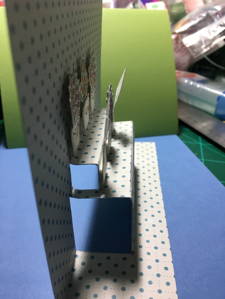
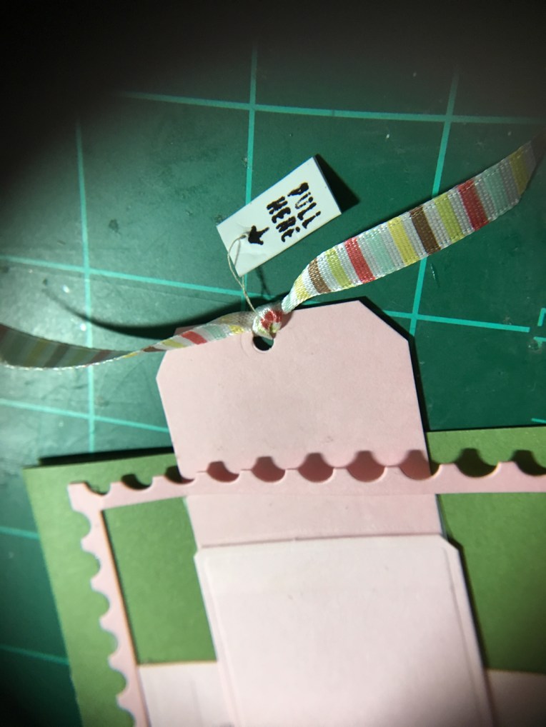
(I’m working on a baseball uniform for my husband’s card as you can see in the photo above.)

IMG_6067

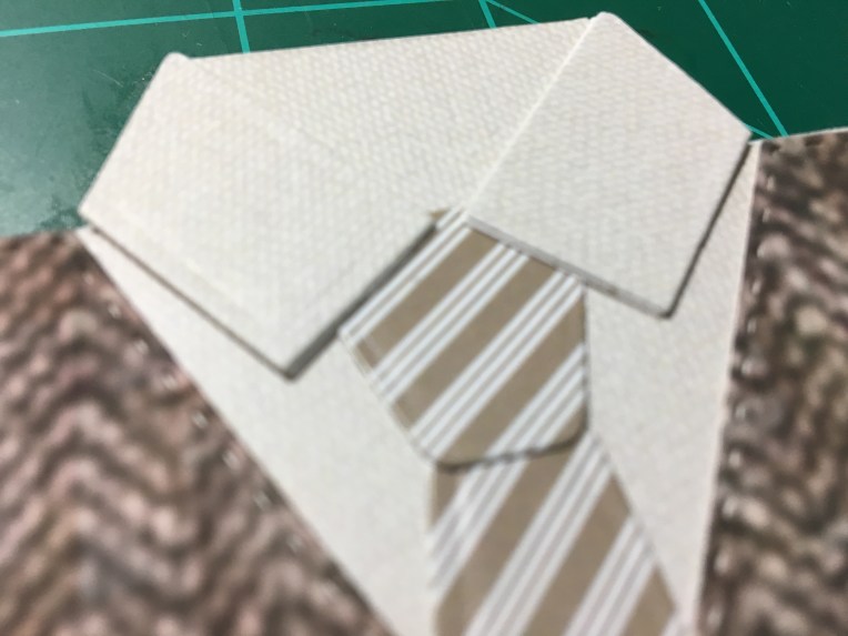
When I cut my shirt fronts out, I had to cut off the collar strips and glue them to the folded shirt base because the paper is printed only on one side. The double layers added dimension to the collar. When I make this card again, I may do the doubling up of the buttons in two layers to add dimension as well.
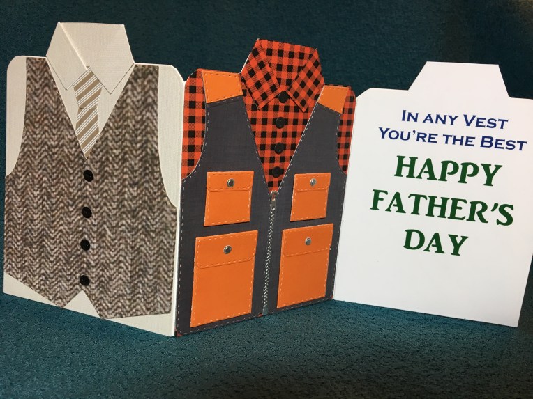
Happy Father’s Day!

Other Father’s Day cards on my blog

A Tool Box Father’s Day

A Fishing Father’s Day

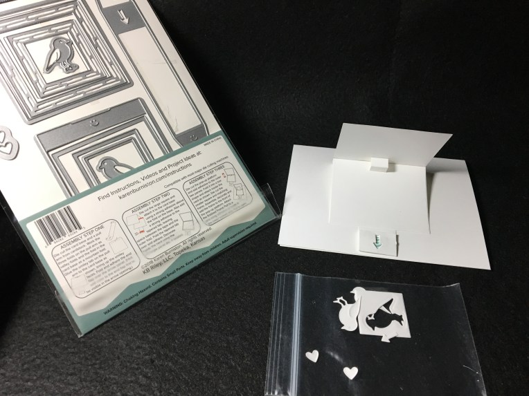
A Father’s Day Waterfall Pop-Up

A Work Bench Father’s Day Card

In-Vested Father’s Day Card

SUPPLIES USED:

Dies

Paper:

Miscellaneous:

Heartfelt


IMG_5868

Sending heartfelt sentiments to a couple who have been married for over 62 years, can be tricky.  You don’t want a card to be too feminine or too masculine. You want it to reflect both of their interests and tastes.

IMG_5860

This card was created using Karen Burniston’s Frame Pull Pop-up die. Since this would be my first time using this die, I cut a set of practice pieces from white cardstock so I can make mistakes without messing-up the printed paper.  This is a practice I am starting to do with more of my KB die sets and storing the practice cards with the die sets for future reference. (I also store my extra cuts and spare pies in tiny plastic bags and keep with the set as well.)

IMG_5856

After watching Karen Burniston’s assembly video again, I made my practice card and then started playing with designing the card. Since the couple the card is for live in Pennsylvania where folk art is big, I thought about trying to a scherenschnitte (cut paper) or fraktur (hand-lettered and painted) card, but my time was limited. So, I looked for printed papers that would have the colors and geometric shapes that are popular with the aforementioned art forms. In going through my paper stash, I came across my tiny bags of shapes cut from junk mail using small paper punches.  This was a huge time saver, but it meant I needed to change up some of my papers I had planned to use because I found a beautiful heart that was graduated from light to dark as if it had been distressed with ink.

IMG_5964[1]

I had new Gemini sentiment dies that I when attempted to cut from heavy black card stock, I found I had to sandwich the cardstock and die between a folded sheet of wax paper to get enough pressure to cut the words out of the heavy cardstock. (My spouse added the dot to the “i” with a fine-tipped marker since I lost the dot on my worktable.)

Assembly time: Having the practice card to refer to, was a mistake saver. I referred to it often to find the glue points that make the card function. While I tried to follow KB’s tip to not glue the top edge of the front mat to the working edge of the from cover as it needs to be flexible, I forgot.  The cover pops up stiffly. (FOLLOW KB’s tip! Don’t over embellish the cover or the inside of the pop-up.)

IMG_5858

SUPPLIES USED:

Dies:

Paper Punches: 

Paper:

Miscellaneous:

Be Adventurous!

IMG_5828
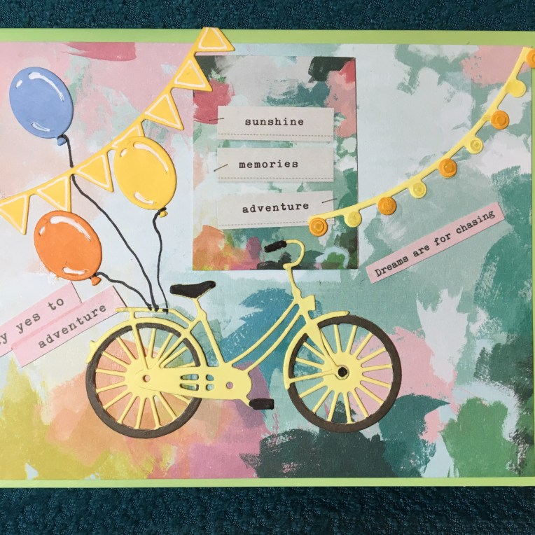
Say yes to adventure. Chase your dreams.  Who knows where it will lead you?  This is a card that tries to capture all these sentiments and to celebrate achievement.

The inspiration for this card comes a desire to use all of my bicycle dies, but morphed into a card trying to only use one paper set (Chasing Dreams by Maggie Holmes for Crate Paper). The bicycle die set is by Simon Says Stamp and has the wheel as a separate die so you can cut the perfect tire from a separate color and has a separate basket die as well. The balloons, string of lights and banner flags are from one of my favorite die sets by Sizzix and Courtney Chilson. A fine tipped black marker was used to color the bike’s handles, pedals and balloon strings. A white gel pen was used to color in the balloons’ highlights.

IMG_5829

While the outside of the card is to suggest the current moment, the inside is to suggest how pleasant the future will be if you chase your dreams and say yes to adventure.

All of the pop-up, stamped, watercolored and die cut images come from the Hero Arts January 2019 My Monthly Hero kit. I had to cut off the top awning of the flower stand and lower it to fit inside the card.  I reinforced the back side of the stand with strips of scrap paper before attaching with double-sided tape.

IMG_5815

The tiered stand was inspired by a tiered pop up cake by Karen Burniston for Elizabeth Craft Designs. Since the die is no longer available, I had to improvise to create the right proportional shelves.

IMG_5816

The outside sentiments come from the paper stack while the inside sentiments are from two separate sets.  The “you’re wonderful” is stamped and embossed from the Hero Arts set and the ”Celebrate” is die-cut from Momenta Firefly’s Celebrate Happy Birthday die set.


SUPPLIES USED:

Dies


Stamps:

Paper:

Miscellaneous:

Potted Flowers Greetings

IMG_5805

A colorful archway of potted plants looking into shaded shelves of plants. What could be more inviting on a hot summer’s day than the cool retreat into a shaded, colorful paradise?

The shadow frames were die cut using the three rectangles from Sizzix’s Courtney Chilston’s Birthday Shadow Box Thinlits set from a set of blue cardstock that progressively gets darker as it goes backwards, just as the light and shades would looking through a doorway on a sunny day.

IMG_5807

This card was created using Poppy Stamps’ Spring Pots Shelves, Spring Pots Frame and Tiny Frogs dies. Two full die cuts were made from each of the pots dies – one in white/cream cardstock and one in green. The green die cuts had the rectangular frame cut away from the vine on the frame and the green shelves had the two shelves separated.  Using colorful scrapes, additional dies cuts were made of pots and flower blooms.  (Hint: Use wax paper over these intricate dies. They will peel off from the back side of the cardstock and take many of the tiny dots and squiggles with them as you peel. Use a poking tool for the rest.)

IMG_5806

The green die cuts were glued onto the white/cream die cuts and the colorful pots and blooms were glued down.  Using some scrap brown kraft-paper, two narrow strips were cut and glued over the separated pots to form two new shelves that were a quarter of an inch longer on each side.

Stampin’ Up’s “Hello There” stamp and coordinating corner stamp complete the front of the card.  (I suggest stamping first before assembling the card.)  The inside sentiment is die cut from a Karen Burniston Word set.

IMG_5804

Foam tape was used between the four layers placing the tape near the cut out rectangle so that foam layers are not directly above each other so that the card will meet the .25” maximum thickness of U.S. Postal Service.

IMG_5803

SUPPLIES USED:

Dies

Poppy Stamps 2174-Spring Pots Shelves

Poppy Stamps 2173 Spring Pots Frame

Poppy Stamps 1781 Tiny Frogs

Sizzix 663581 Courtney Chilston’s Birthday Shadow Box

Karen Burniston in cahoots with Riley & Co. 1002 Word Set 1- Greetings


Stamps:

Stampin’Up 147464 Around The Corner


Miscellaneous:

Wax Paper

Scotch Foam Tape

Tombow Aqua Mono Liquid Glue

Crayola Signature Brush & Detail Dual-ended Markers

Happy Mail

happy Mail card envelop 1

Happy mail is when you get note from someone you haven’t heard from in a while. Happy mail is opening an envelope and getting good news.  Happy mail makes you smile.

I love getting interactive cards. Not only do they stand out as different, but they make me think that someone went to a lot of trouble to design and get the mechanics right on how it works. Concord & 9th’s new Mail Drop stamp and coordinating dies are happy mail for me.

happy Mail card envelop 2

I made this test card from the set as a birthday card, but the other phrases in the set allow for creativity and customization.  Getting the slit in the correct spot on both the envelope and the backing panel took several tries.  I recommend watching this video to get it right the first time.

Long Live Snail Mail!

Paris in Springtime

IMG_5767IMG_5742

What a romantic image of Paris !  When I received the two dies that I used on this card, I looked at the packaging images for ideas for colors and layout and then did some modification to the easel mechanism.

IMG_5763

Changing the frame from a hanging charm to a larger flat panel on an easel was as simple as using ½ inch wide, red-sticky-permanent double-sided tape to hold in place the rectangle piece that was cut out for the frame.  And adhering the flat panel to the easel.

57797289798__0923E463-C45B-4C12-95BB-A64D3D2307D1

Because the flat panel is larger than the original frame pull tab, I had to add an extension tab. I used clear removable tape to smooth over the catching point where the extension level changes. In order to be able to fit the card in an A2 envelope, I punched a hole and tied a ribbon to the tab as a pull grip.

Pull Here

But how does the card recipient know to pull the ribbon?  Read my last post on CRX.

IMG_5767

Paris Easel Card

Paris in the Springtime Die set from Die Cutting essentials  issue 49

Karen Burniston’s Pop It Ups for Elizabeth Craft Designs 1104-Hanging Charm Pull Tab die set

“Pull Here” stamp from Concord and Ninth’s Mail Drop Stamp Collection


CRX – Card Recipient Experience

You create the most delightful card that moves went you pull a slider or you create a box card that folds flat, and the recipient of the card gets it in the mail and has no idea how to make it work.  This is not the ideal card recipient experience (CRX) you want.

In the web designers world, they talk about User Experience (UX). For us in the not so digital field of card designers, we need to think about CRX or how we let our users know how to operate the card if the recipient is not use to receiving interactive cards.

Arrows indicating direction to pull a slider tab are common.  Including a diagram of how a box card should look when completed is simple enough. Or you can get creative and string a “pull here” tag on a thread that can be removed once used.

A great card is both beautiful to the eye of the beholder and easily explained if it involves moving parts.

Dies/Stamps Used:

You’re In My Thoughts Box of Flowers

Lawn Fawn Scalloped Box Card Pop-Up

Build -A-Bouquet Stamp Collection for Papercrafter magazine issue 118 

Stamped in black ink and colored with Crayola Signature Brush & Detail Dual-ended Markers

Tea and Tulips Box of Flowers

Lawn Fawn Scalloped Box Card Pop-Up

Stampin’ Up’s Tearoom Copper Vinyl Stickers

Stampin’ Up’s Tea Room Specialty Designer Series Paper

Tea Room Memories & More Card Pack.

Shaded Tulip Stamp & Layer set by Susan Bates for Papercraft Inspirations magazine, issue 182

CraftSmart and Hampton Art mini ink pads.

Paris Easel Card

Paris in the Springtime Die set from Die Cutting essentials  issue 49

Karen Burniston’s Pop It Ups for Elizabeth Craft Designs 1104-Hanging Charm Pull Tab die set

“Pull Here” stamp from Concord and Ninth’s Mail Drop Stamp Collection