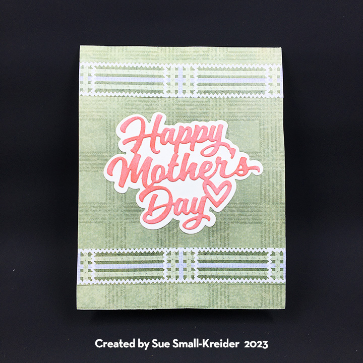
Recently I received a commission to make a Mother’s Day card that was to have all four of her children’s birthdays and names on it. The recipient likes gardening, traditionally receives flowers on Mother’s Day to plant in her garden and may soon be moving to a new home.
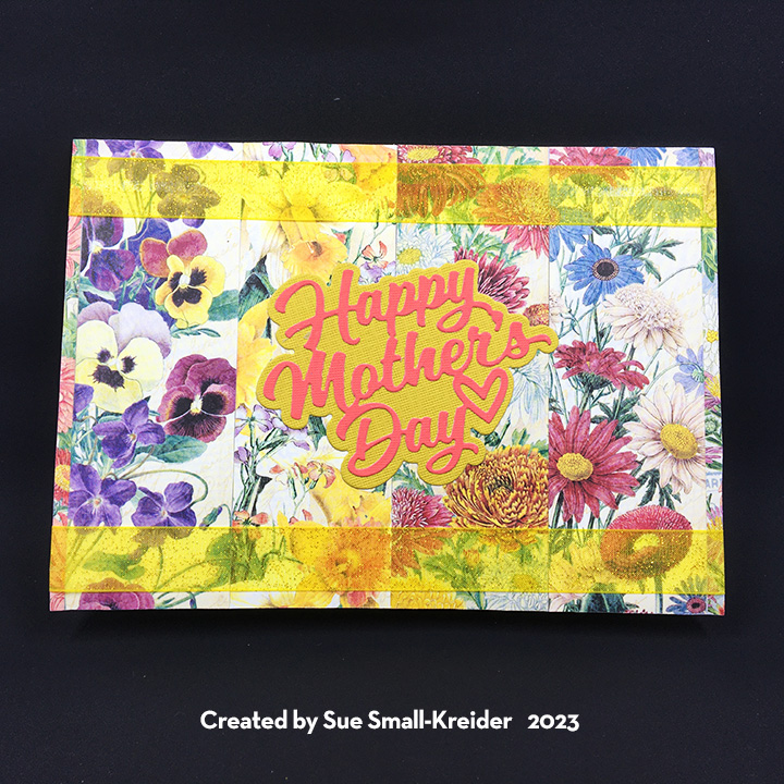
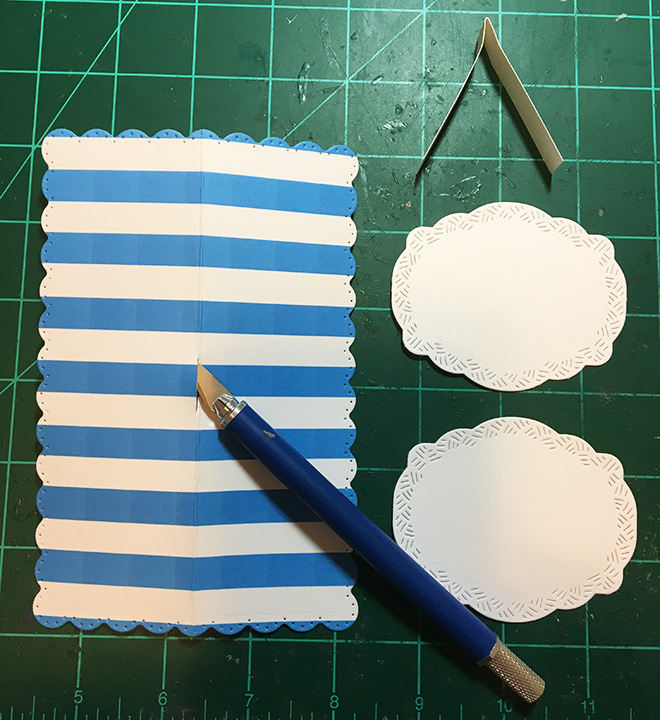
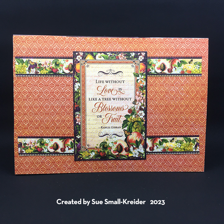
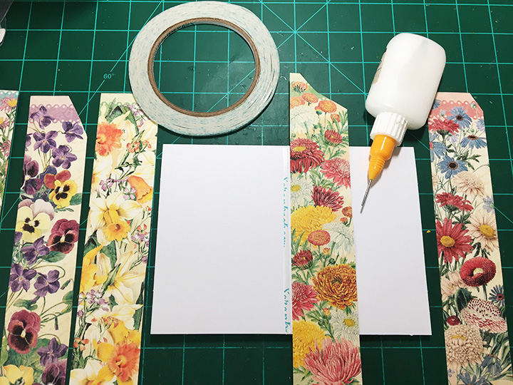
I began by looking through my paper stash and settled on a Graphic 45 paper collection that featured flowers of the months. Karen Burniston’s Waterfall Card dies made it easy to create four different waterfall panels. It was the backgrounds panels for the card that were a bit more difficult since I had already cut into the papers for other projects. I ended up piecing together stripes of the flowers from the various months needed for the front of the card and a patchwork for the inside top panel. For the inside bottom panel that the waterfall rests on, I made stripes of the ribbon from the various flower papers. The card back is a whole piece of flowered cardstock.
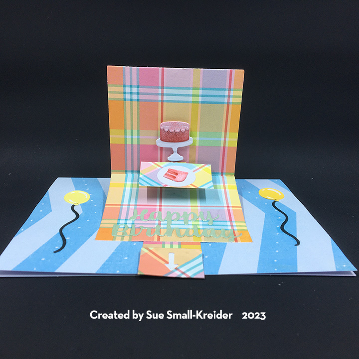
Having reviewed the waterfall assembly video, I knew that a 5×7 (A7 size) card base with a top fold could accommodate the waterfall. For the hidden message of “love you,” I used the words from Karen Burniston’s Words Set 13 to die-cut into the decorative panel that goes to the pull strip. The background papers had all been adhered to the purchased card base when I die cut the finger semi-circle into the card base bottom panel. Having assembled the waterfall mechanism, I then stapled it onto the card base as shown in the assembly video.

For the customization of the names and birthdays, I used the postage stamp ephemera pieces from the paper collection for the month and then added the names and dates using Karen Burniston’s Mini Alphabet and Numbers die set.

Ribbon can hide a multiple of small mistakes and liven up a card. On this card it softens the staples on the back of the card and brightens up the card front. The front sentiment is Karen Burniston’s “Happy Mother’s Day” which includes a shadow background die in the set. The white label inside can be used for a personal message and is cut using the largest of the fancy labels in the Crosshatch Rectangles and Labels die set.

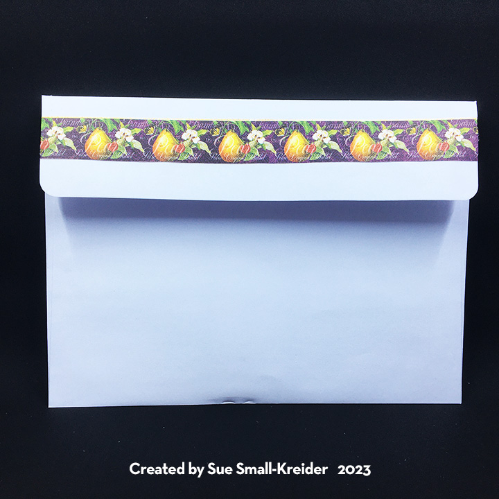
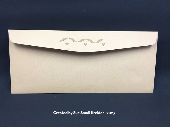
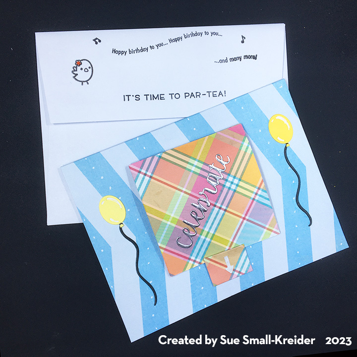
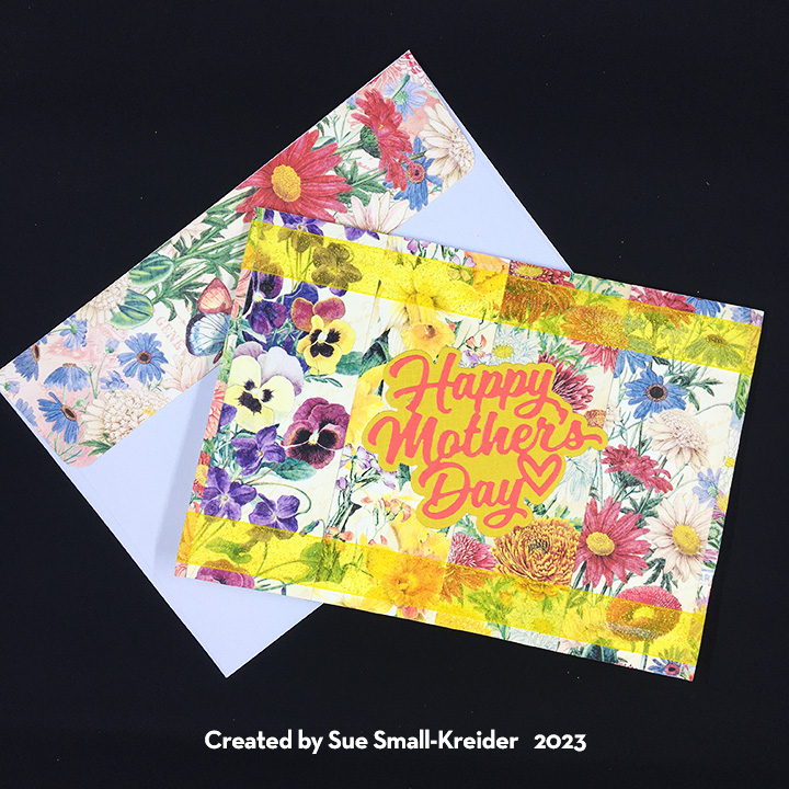
The envelope uses more of the flowered paper for the back flap.
Materials Used:
Dies
- Karen Burniston in cahoots with Riley and Company – Rectangles and Labels – Crosshatch – 1233
- Karen Burniston in cahoots with Riley and Company – Mini Alphabet and Numbers – 1197
- Karen Burniston in cahoots with Riley and Company – Word Set 13 – Snow – 1167
- Karen Burniston in cahoots with Riley and Company – Happy Mother’s Day – 1163
- Karen Burniston in cahoots with Riley and Company – Waterfall Card – 1161
Papers
- Graphic 45 – 12×12 Double-Sided Paper – Flower Market Collection
- DCWV – Textured Cardstock Stack 12×12 – Brights
- Black Cardstock
- Park Lane Paperie – A7 Card Base and Envelope – White
Pens
- Pigma Micronn – Archival Ink – 01 Tip – Black
- Sharpie – Permanent Marker -Ultra Fine Point – Black
Adhesives
- Neutral PH Adhesive by LINECO
- Fine-Tip Glue Bottle
- Scrapbook.com – Double-Sided Tape -1/8-inch wide
- Clear Removable Tape
Tools
- Die Cutting Machine
- We R Memory Keepers – Quickstik
- Scissors
- Stapler
- Pencil
Miscellaneous
- Yellow Organza 3/4-Inch Wide Ribbon