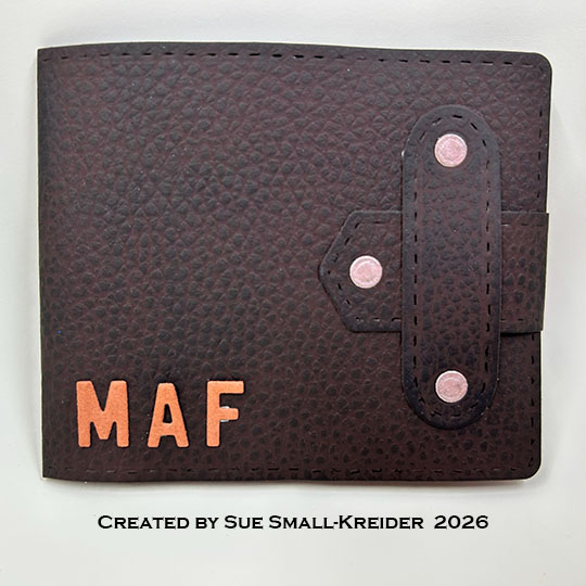
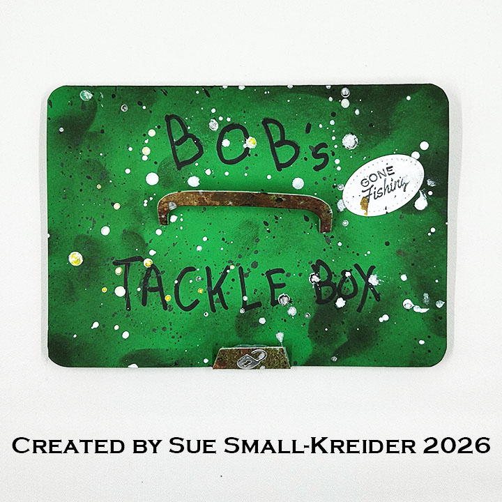
It’s time for the Karen Burniston Design Team July 2026 Challenge whose theme is BOX or BLOCKS. I chose to make a pop-up card in the form of a tackle box using the Rockin’ Rectangle Pop-Up mechanism.
Watch the process video to see how I made this card.
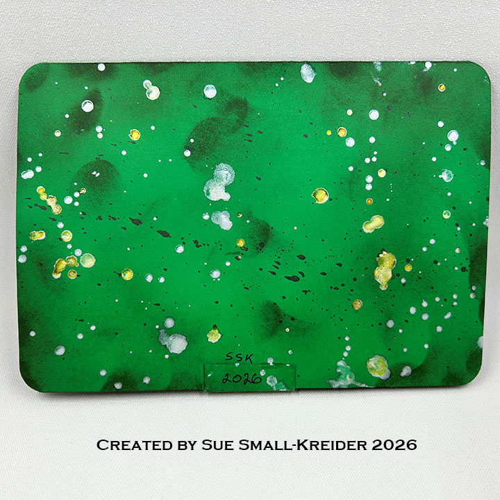
Cardbase: I folded a 10×7-inch piece of cardstock in half to make a 5×7-inch top fold cardbase. Next, I rounded the corners with a large corner rounder punch. (You could also use scissors to round the corners.) I ended up using splatters of white, bronze and black paint to decorate the card front and back beside using brown ink to blend the card edges.
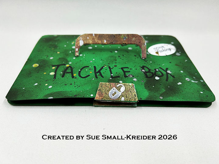
Handle: Using the rounded corner panel dies in the Twist Panel Pop-Up, cut a handle as shown in the video above and glue onto the front of the card.
Latch Mechanism: The latch is cut from the set using the Rockin’ Rectangle Pop-Up long strip die and trimming off the end with the slots. (Follow the instructions in the video above.) The lock comes from the Treasure Chest set. The “PULL” label was cut from silver using a die from the Waterfall Card die set. I used two thin magnets to close the latch.
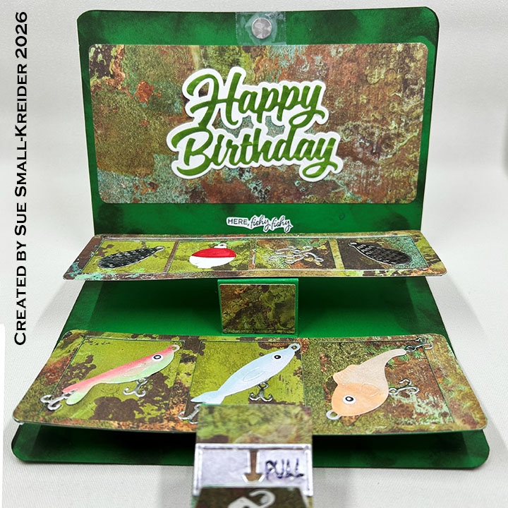
Trays Pop-Up: (View die set’s assembly video by clicking on the die set and scrolling to the bottom of the linked page.) Inside the card two trays pop-up using the Rockin’ Rectangle Pop-Up. See the video above for how I installed it inside the the card using the latch strip. The top tray is made of two strips 2×6.625-inches of heavy cardstock covered with decorative paper. One piece has had four squares cut into it using a 1.4-inch square die from the Squares – Crosshatch set. The bottom tray is made from two strips 2.375×6.625-inches of heavy cardstock covered with decorative paper. One of the bottom tray pieces was cut with three rectangles using the pieces rectangle from the Waterfall Card set. Watch the video above for the assembly.
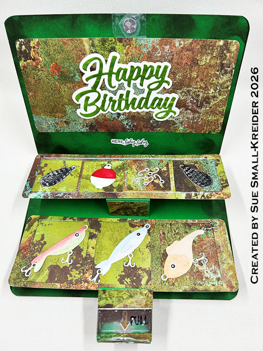
Fishing Lures: The Fishing Lure Charms were used for the lures. I followed the packaging pictures for how I made them. (If you want an explanation and tips for how to assemble the lures, view my video for Here Fishy, Fishy…A Father’s Day Card and watch the video above.)
Sentiments: The front sticker of “Gone Fishing” and the inside “Here Fishy, Fishy” are from the Fishing stamp set with the oval cut using the small oval in the Rockin’ Rectangle Pop-Up. “Happy Birthday” inside the card uses Happy Birthday word die and its shadow die. “Bob’s Tackle Box” was written with a black marker as it might be written on a real box.
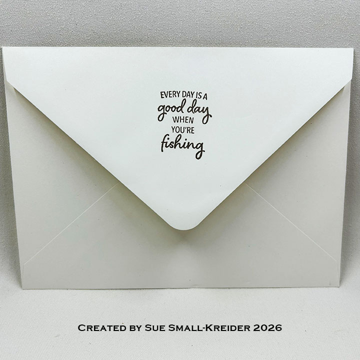
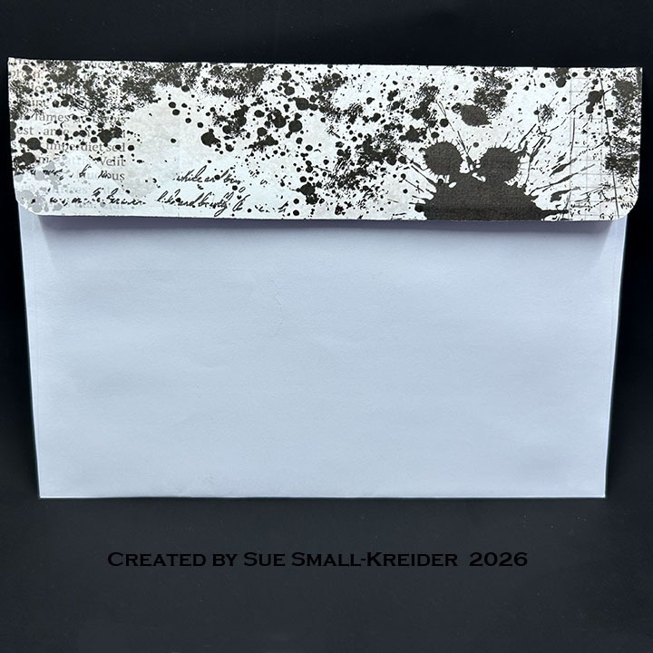
Envelope: The card fits into an A7 (5x 7-inches) size envelope with “Every day is a good day when you’re fishing” stamped on the back flap from the Fishing stamp set.
___________________________________
Thank you for experiencing this blog post.
I hope this inspires you and makes you smile.
Please subscribe, like and leave comments 😊
___________________________________
Disclaimer: Karen Burniston products are provided free of charge by the manufacturer for review and use. All other items were personally purchased. Compensated affiliate links used where or when possible, meaning I will receive a small percentage commission from these manufacturers at no cost to you. This will allow me to add more content to my YouTube channel and help out a lot. Thank you.
Materials Used:
- Karen Burniston in cahoots with Riley and Company – Fishing Lure Charms– 1303
- Karen Burniston in cahoots with Riley and Company – Waterfall Card– 1161
- Karen Burniston in cahoots with Riley and Company – Treasure Chest – 1121
- Karen Burniston in cahoots with Riley and Company – Rockin’ Rectangle Pop-Up – 1089
- Karen Burniston in cahoots with Riley and Company – Happy Birthday Shadow – 1179
- Karen Burniston in cahoots with Riley and Company – Squares – Crosshatch – 1056
- Karen Burniston in cahoots with Riley and Company – Happy Birthday – 1030
- Karen Burniston in cahoots with Riley and Company – Twist Panel Pop-Up – 1009
Stamps
Papers
- Craft Consortium – 12×12 Double-Sided Essential Craft Paper – Metal Textures
- Green 100lb Cardstock
- Silver Cardstock
- White Cardstock
- Park Lane Paperie – A7 Envelope – White
Ink
- American Crafts – Metallic Marker – Silver
- Catherine Pooler – Pearl Shimmer
- Hero Arts – Silk Ink – Bronze
- Memento – Fade Resistant Dye Ink – Rich Cocoa & Tuxedo Black
- • Ranger – Tim Holtz – Distress Ink- Scorched Timber
- Sakura – Gelly Roll Pen – Medium – White
- Sharpie – Permanent Marker – Chisel Tip – Black
- Sharpie – Permanent Marker – Fine Tip – Olive Green & Red
- Sharpie – Permanent Marker – Ultra Fine Tip – Black
- Scrapbook.com – Shimmer Glitter Brush Marker – Coral, Peony, Red Shimmer, Key Lime Green, Frosty Blue
- Spellbinders – Splatter Effects – Raven
- StazOn – Solvent Ink – Jet Black
Adhesives
Tools
- Bone Folder
- Corner Rounder Punches – Large & Small
- Die Cutting Machine
- Glue Eraser
- Ink Blending Brush
- Paper Masking Tape
- Ruler
- Stamping Blocks used as paperweights
- Scissors
- Tweezers
- We R – Precision Press Mini – Stamping Platform
- We R Memories – QuickStick
Miscellaneous
- Pear Scrappy Tails – Craft Magnets