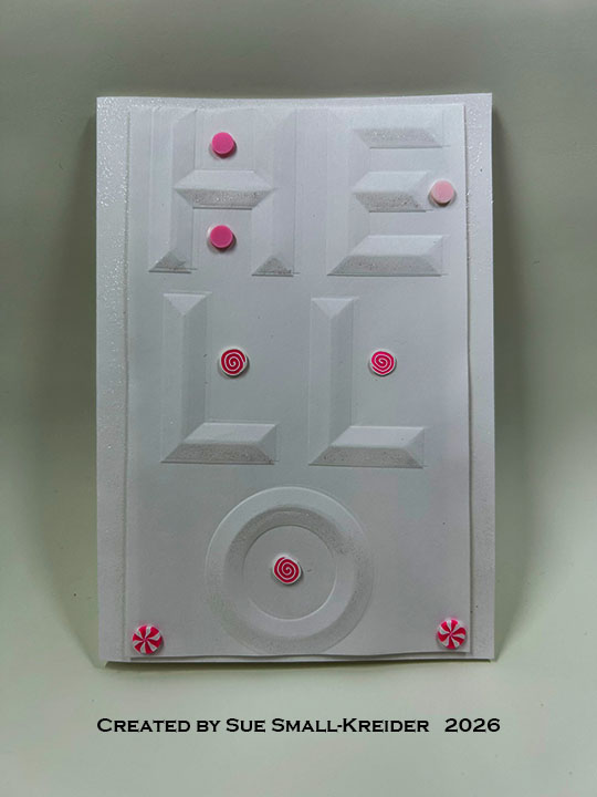
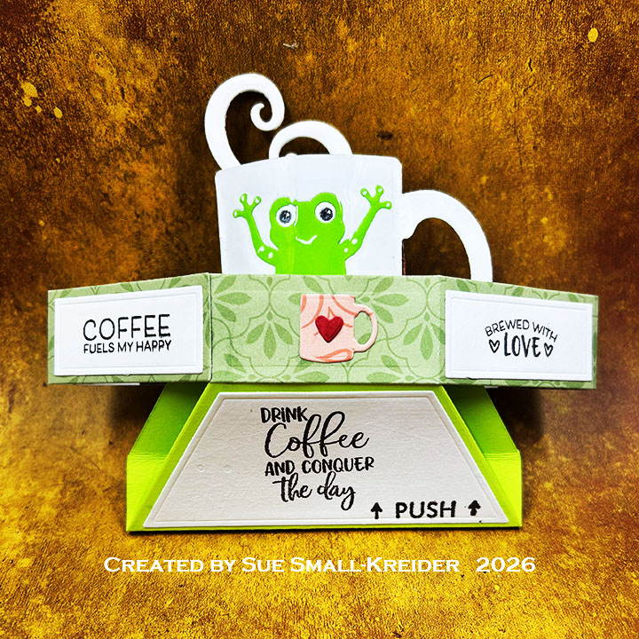
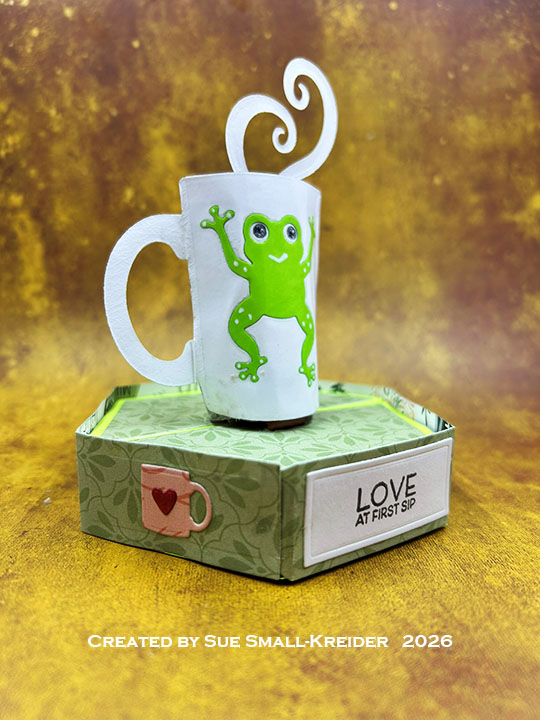
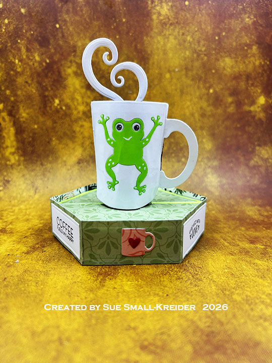
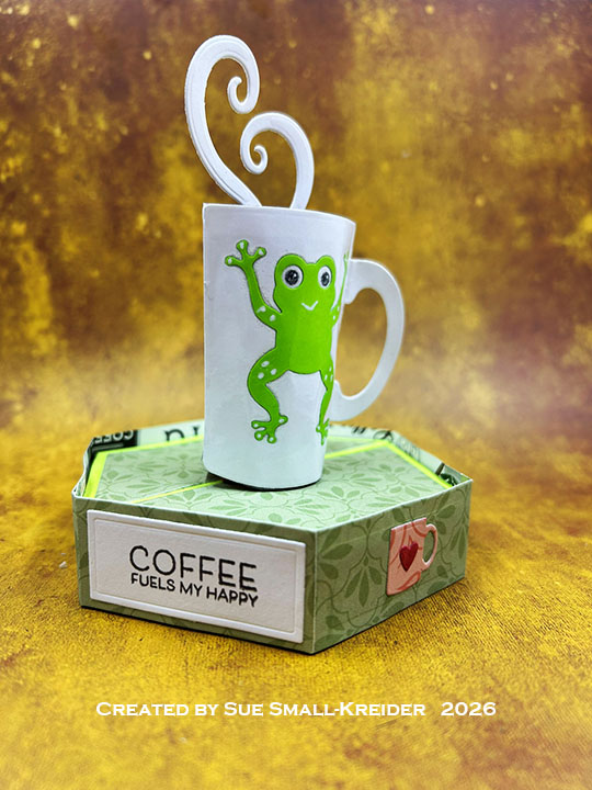
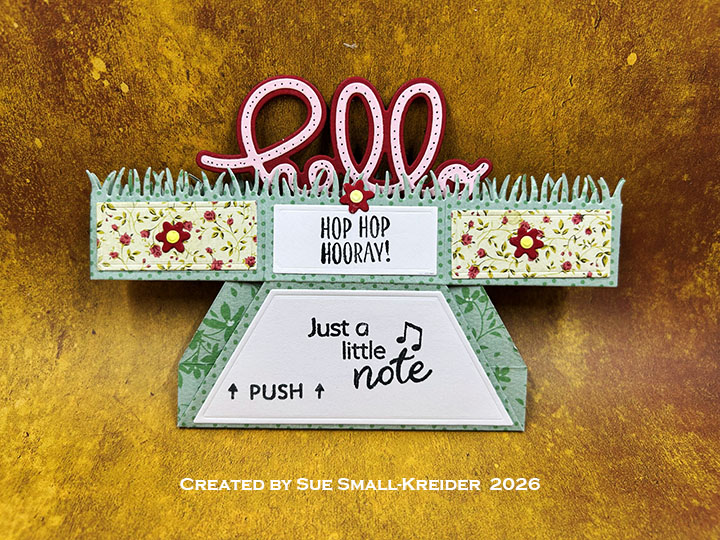
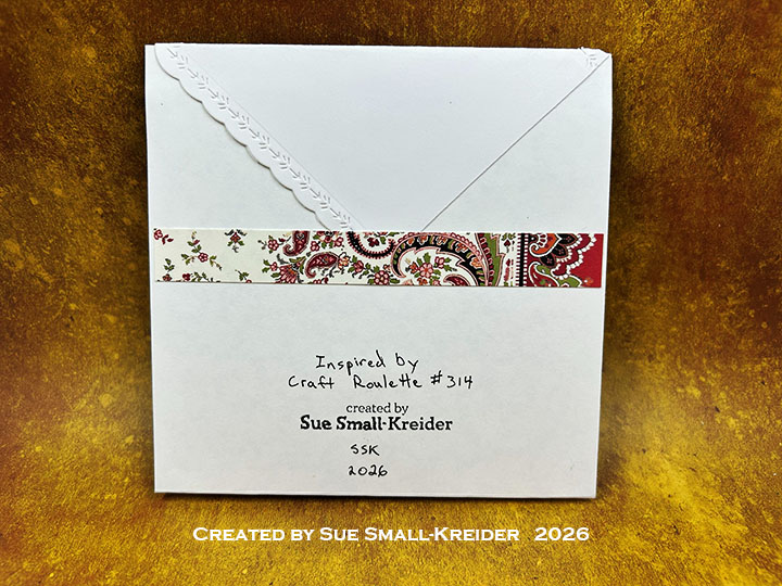
I’m here today with a 4-inch square card using Relatively Thoughtful digital papers – A collection called Overthinking in Colour by Karolina Osuchowska.
Watch the process video to see how I made this card.
Cardbase: I printed on both sides of an 8.5×11-inch of lightweight cardstock using one graffiti wall design and one colorful design. Next I cut it into an 8.25×8.25-inch square and scored and folded at 4-inches on each side and along one of the diagonal corner to corner. (See the video above for basic directions.)
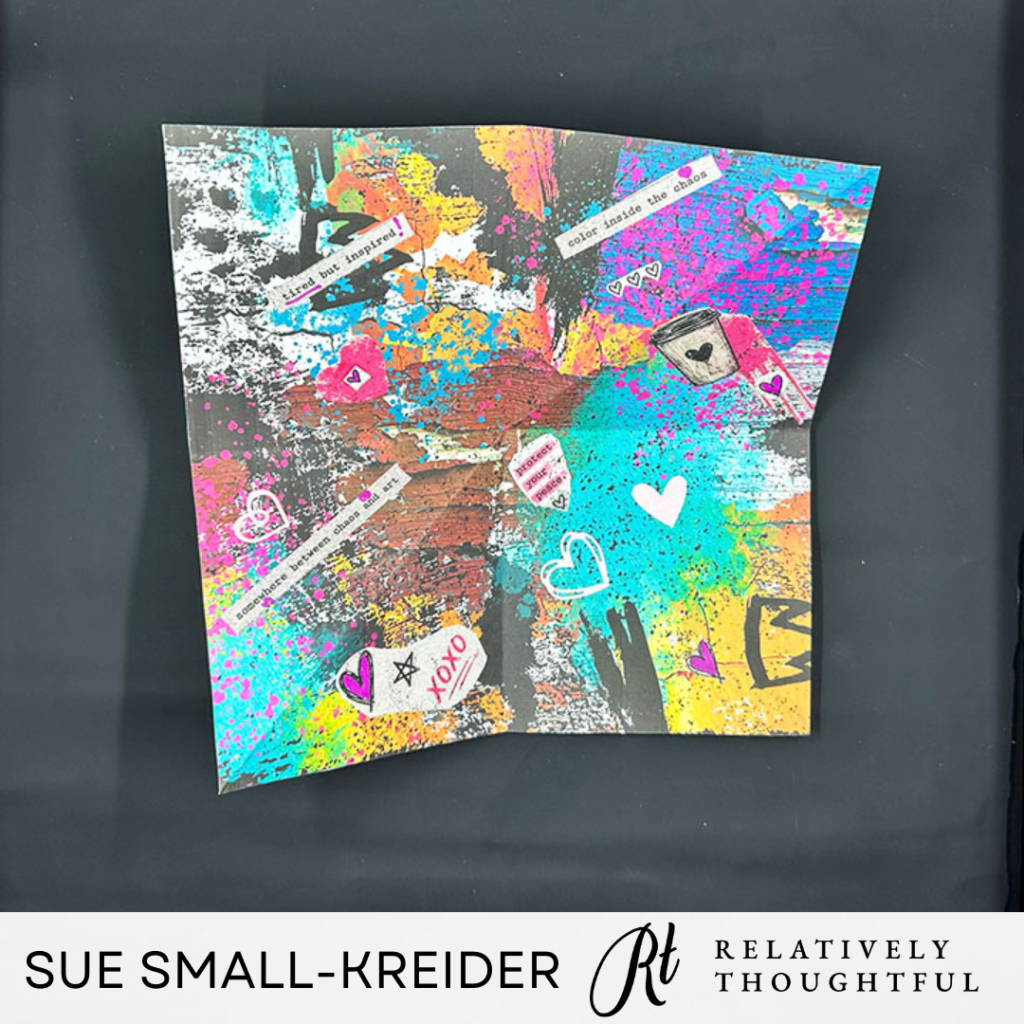
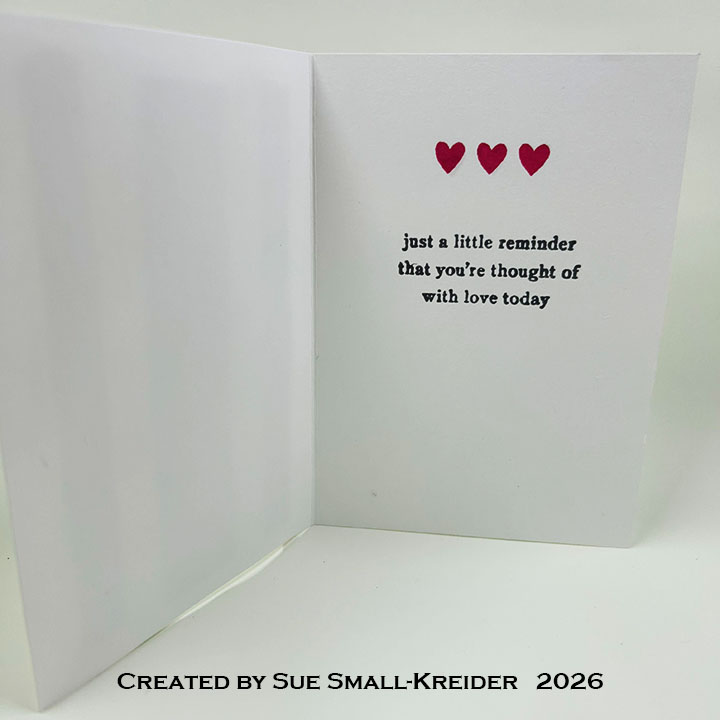
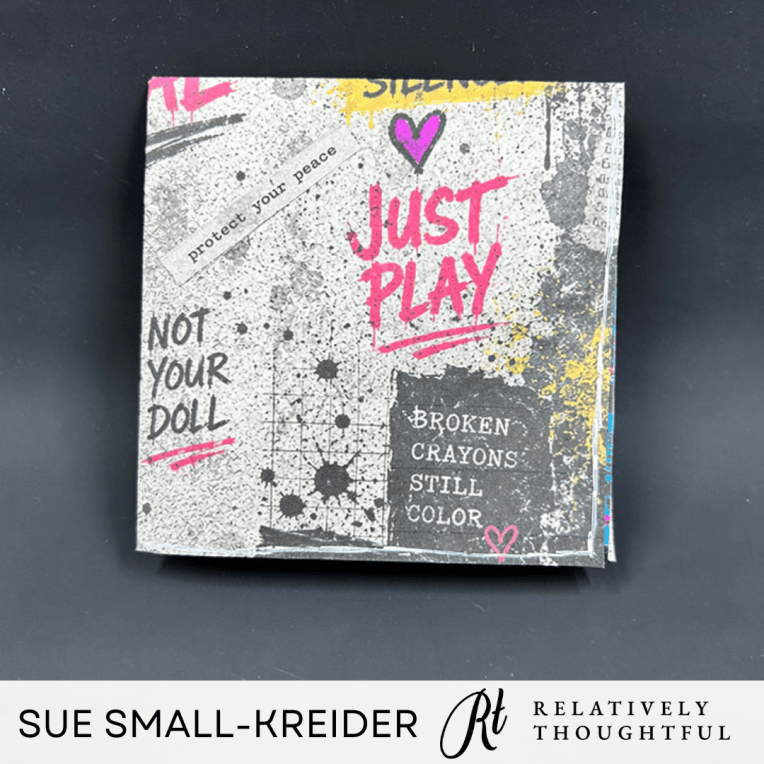
Card: Once the card was folded, I added hearts and sentiments cut from the paper collection. Next I colored some of the hearts in with a pink marker and added white lines around the outside edge of the paper.
Sentiments: All the sentiment strips I added talk about art, inspiration, love, peace, happiness and encouragement. The outside sentiments are part of the printed paper design.
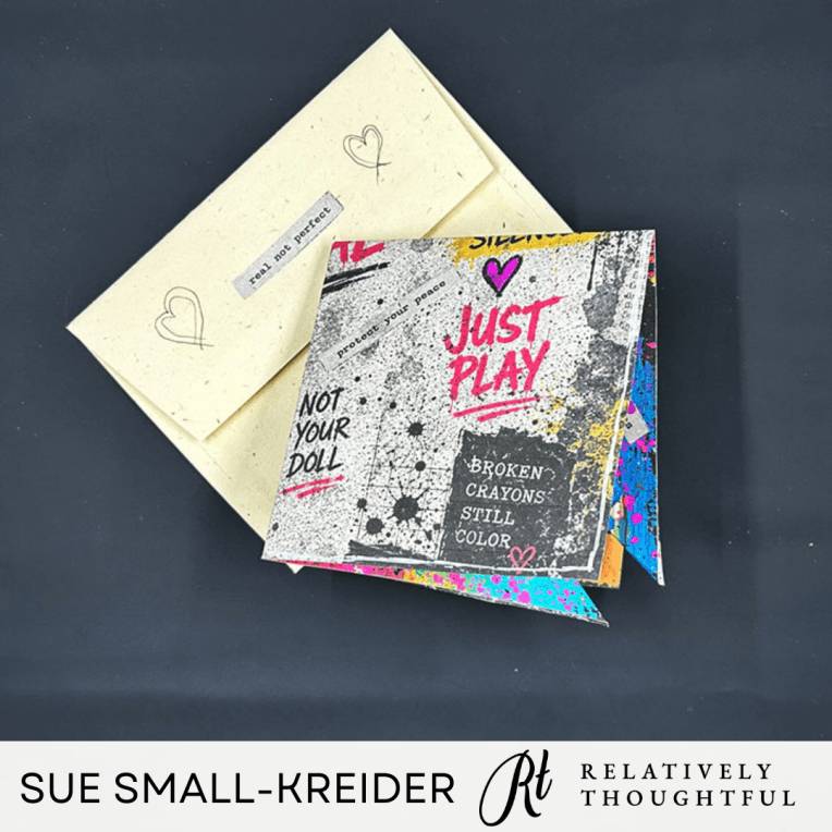
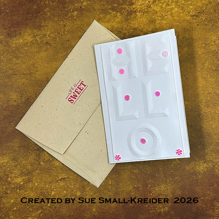
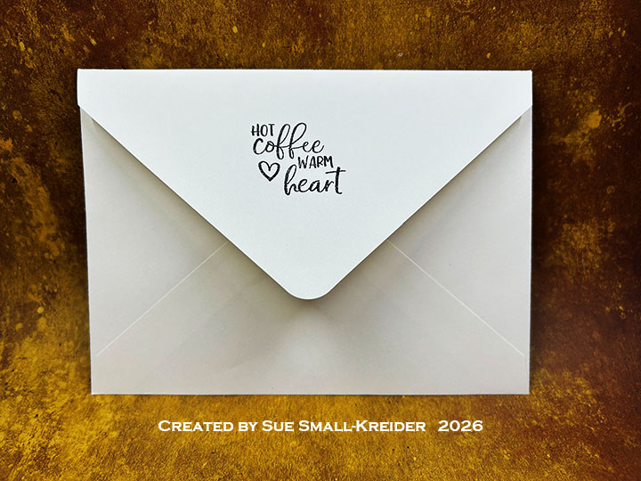
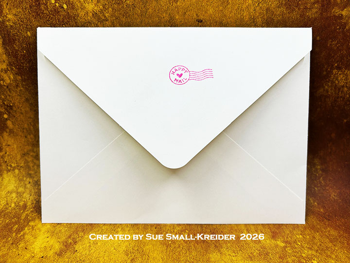
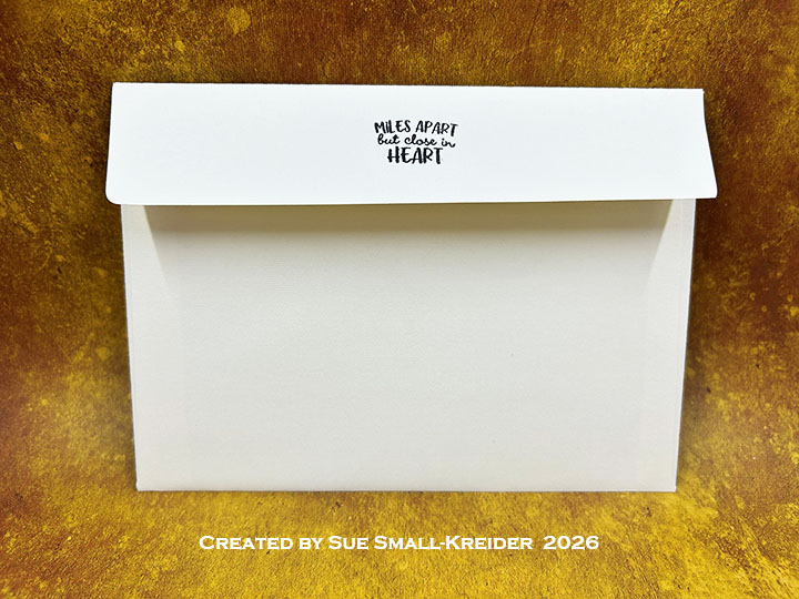
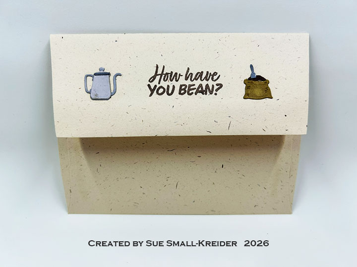
Envelope: The card fits into an A2 (4.25×5.5-inch) envelope with its back flap decorated with hand-drawn hearts and a sentiment strip.
___________________________________
Thank you for experiencing this blog post.
I hope this inspires you and makes you smile.
Please subscribe, like and leave comments 😊
Follow my YouTube channel, Instagram and Pinterest as well.
___________________________________
Disclaimer: Relatively Thoughtful and Karen Burniston products were provided for free or at a discount by the manufacturer for review and use. All other items were personally purchased. Compensated affiliate links used where or when possible, meaning I will receive a small percentage commission from these manufacturers at no cost to you. This will allow me to add more content to my YouTube channel and help out a lot. Thank you.
Materials Used:
Papers
- Relatively Thoughtful – Digital Collection – Overthinking in Colour
- The Paper Studio – 8.5×11 Cardstock -65lb – White
- Fraser Papers for William House – A2 Envelope – Genesis Text Milkweed Smooth
Inks
- OLO Marker – Dragon Fruit
- Pigma – Mircon 005 Fine Tip Pen – Black
- Sakura – Gelly Roll Pen – Medium – White
Adhesives
- Neutral PH Adhesive by LINECO
- Fine-Tip Glue Bottle
Tools
- Computer and Color Printer
- Scissors