There is nothing so relaxing as a train ride through the mountains. Seeing the pine trees at the higher elevations and the babbling streams in the gullies. Hearing the chug-chug-chugging of the steam engine and experiencing the darkness of a mountain tunnel coming back into the sunlight.

In my challenge to myself to see how many different themed cards I can make with Karen Burniston’s new Fireplace die set; I decided on a mountain train tunnel with the mouth of the tunnel using the fireplace mechanism’s opening. All the dies used are by Karen Burniston.

I had made multiple train cars and engines for an earlier project. (Watch the assembly video for the trains.) The train tracks are from a train elements set and I cut 4 of them to have enough pieces to form the track I needed for the front and inside of the card. For the smoke from the smokestack, I turned the smallest cloud from the Outdoor Scene set on its side and glued inside the stack.

The front of the card uses curving hillside with large pine trees from the Outdoor Scene set and the treeless curving stitched edger from the Long Nature Edges set for the foothills. I shaded the hillside tope edges with a pale brown ink.

For the card’s sentiment, I double cut the large words “Enjoy” and “ride” once from brown and again from black so that I could offset them to create a shadow. The oval cuts out the word “THE” so it is backed with a scrap of black.

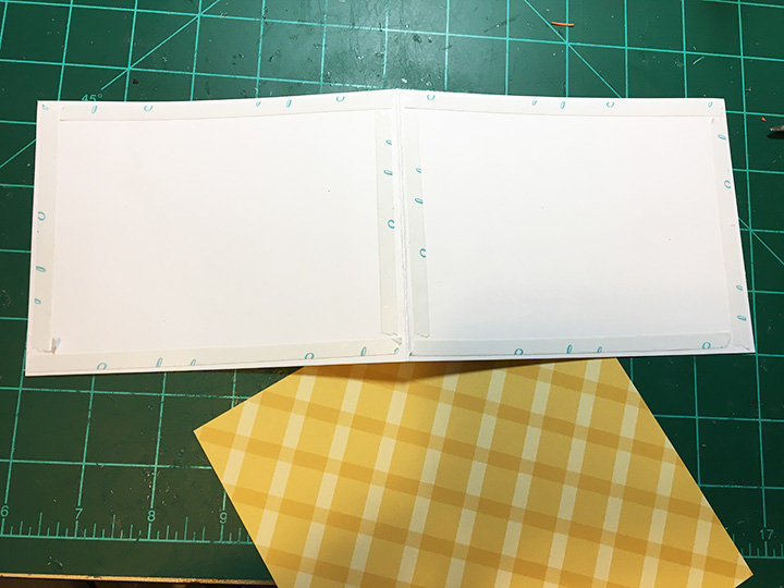
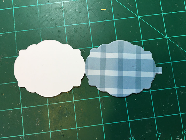
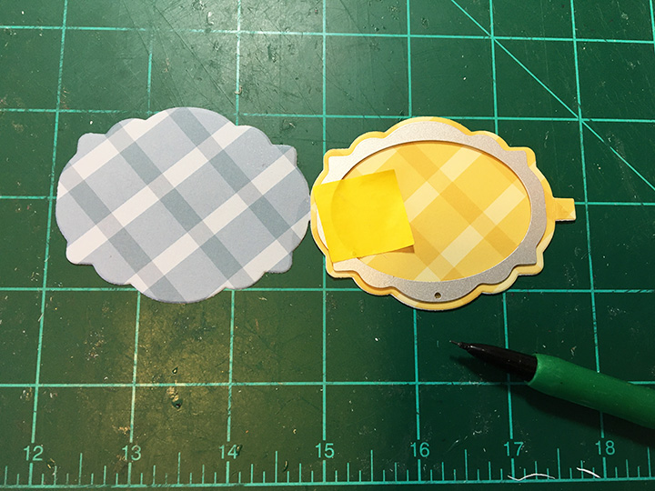
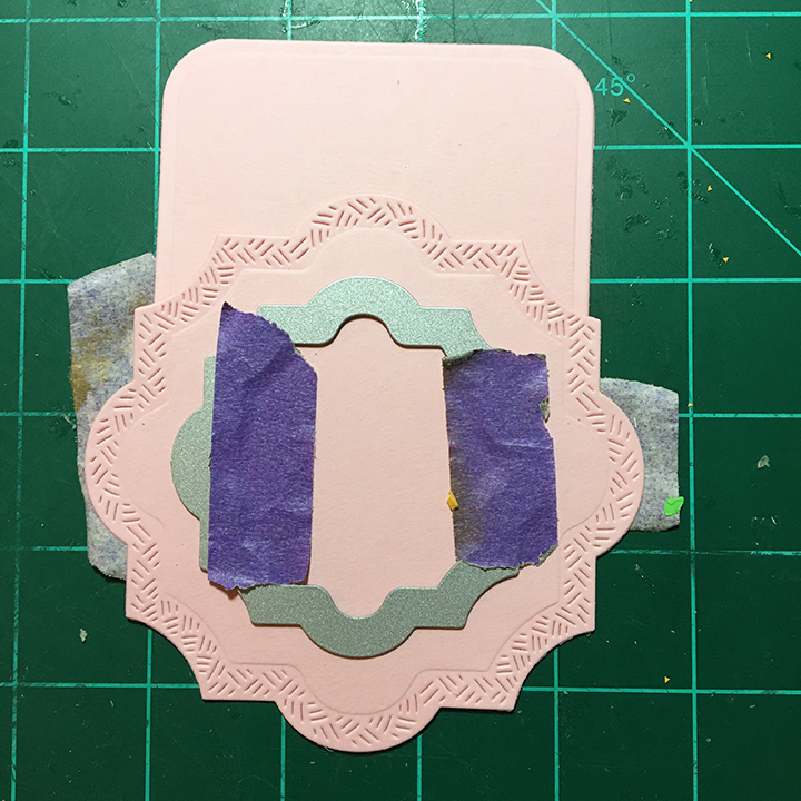
The inside of the card requires some practice laying out to get the right placement of the mountains, so they won’t stick out of the card when closed. (Watch the fireplace assembly video before laying out and assembling.) I used scrap pieces of brown lightweight cardstock to cut my crosshatch ovals. (Largest oval die in set was used.) I cut off the bottom of the ovals to have varying heights. The largest oval I turned over on the back, traced the mechanism opening onto and then die-cut the opening using the second to smallest to fit inside the penciled opening.


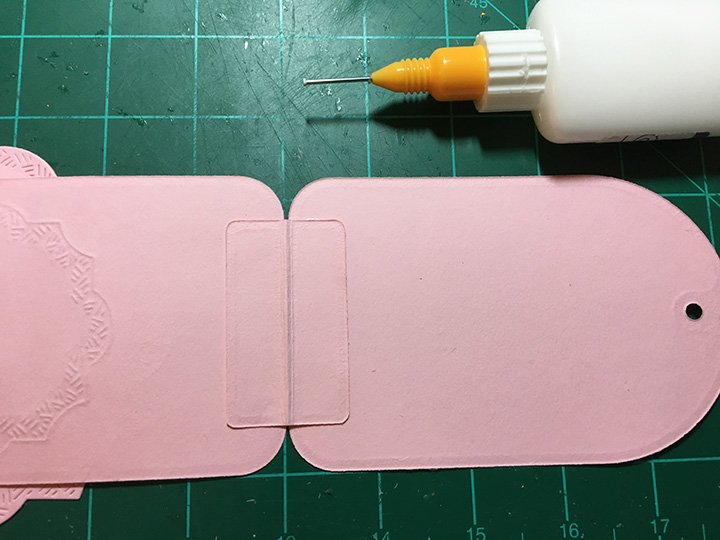
The smaller ovals are glued to the sides and behind the oval with the tunnel opening. I then adhered the fireplace mechanism as shown in assembly video and glued the mountains onto mechanism matching up the openings. Next, I pieced together the train tracks to come out of the tunnel and near the side of the mountains. Using the pop-up strip from the Fireplace die set and the two angled pop-ups from the Mini Pops set, played with placement of the pop-ups with the train pieces to set spacing. Glue the pop-ups first and once their glue has set, then adhere the train pieces. (I bent the pop-ups at their original scored folds, but you might play with other folds and or strips to get a more realistic alignment of the train cars.)


The babbling stream is created from strips of patterned paper cut with the Long Nature Edges curving stitched edger. The diagonal placement adds drama to the card and space in the corner to write a personal message.

Leftover pieces from the train track as well as pieces from other card projects complete the back of the card.

As is my habit, I decorated the envelope back flap with additional train pieces to hint at what’s inside.
Thank you for reading this blog post. Please like and leave comments 😊
Materials Used:
Dies
- Karen Burniston in cahoots with Riley and Company – Fireplace Pop-Up – 1210
- Karen Burniston in cahoots with Riley and Company – Long Nature Edges – 1152
- Karen Burniston in cahoots with Riley and Company – Mini Pops Pop-Ups – 1146
- Karen Burniston in cahoots with Riley and Company – Train Elements – 1107
- Karen Burniston in cahoots with Riley and Company – Train Pivot Panels – 1106
- Karen Burniston in cahoots with Riley and Company – Enjoy The Ride – 1103
- Karen Burniston in cahoots with Riley and Company – Ovals – Crosshatch – 1055
- Karen Burniston in cahoots with Riley and Company – Outdoor Scene – 1045
Papers
- Colored, coated and glitter cardstock and patterned paper scraps
- American Crafts – 5 x7 Kraft card & A7 envelope
Inks
- Green fine-tipped marker
- Ranger – Tim Holtz -Distress Ink – Antique Linen
Miscellaneous
- Neutral PH Adhesive by LINECO
- Fine-Tip Glue Bottle
- Die Cutting machine
- Pokey tool
- Scissors