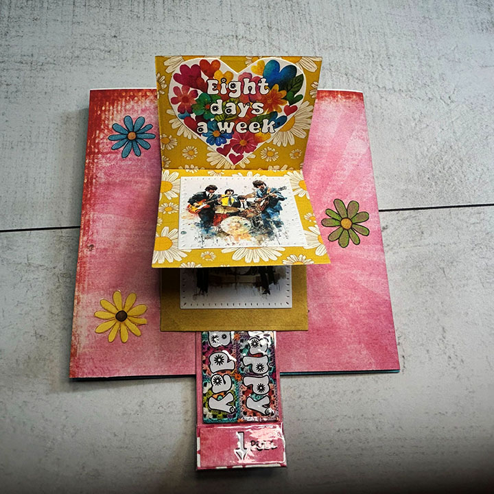
This wedding card was commissioned for a couple who love the mountains, music and want to live a life in sync with nature.
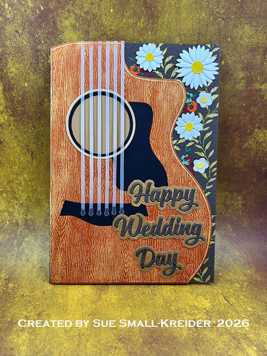
Cardbase: I folded an 8.5×11 sheet of caramel-colored 65lb. cardstock in half to create a 5.5×8.5-inch cardbase. Next, I used the large guitar die from the Paper Discovery Music – Play On -Guitar & Violin to cut a shaped cardbase on the fold.
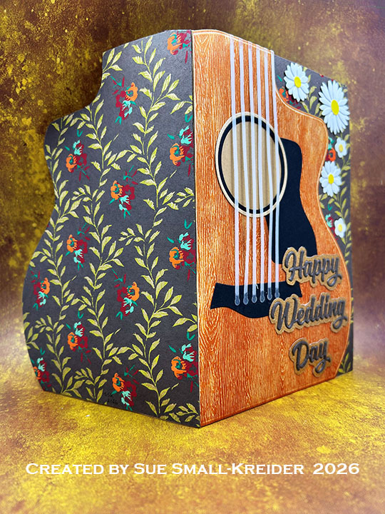
Guitar Front: Using the guitar die from Paper Discovery Music – Play On -Guitar & Violin, I cut a single layer guitar from woodgrain embossed cardstock and stained it using the ink cube of Rusty Hinge Distress ink. Next, I cut the sound hole circle into the woodgrain guitar. The trim pieces of the circle were cut from black and the un-stained woodgrain cardstock. The pickguard and bridge pieces were cut from black. Clear vellum was used for the strings. (I found using a clear ruler with 1/8-inch grid helped with gluing the strings on straight.)
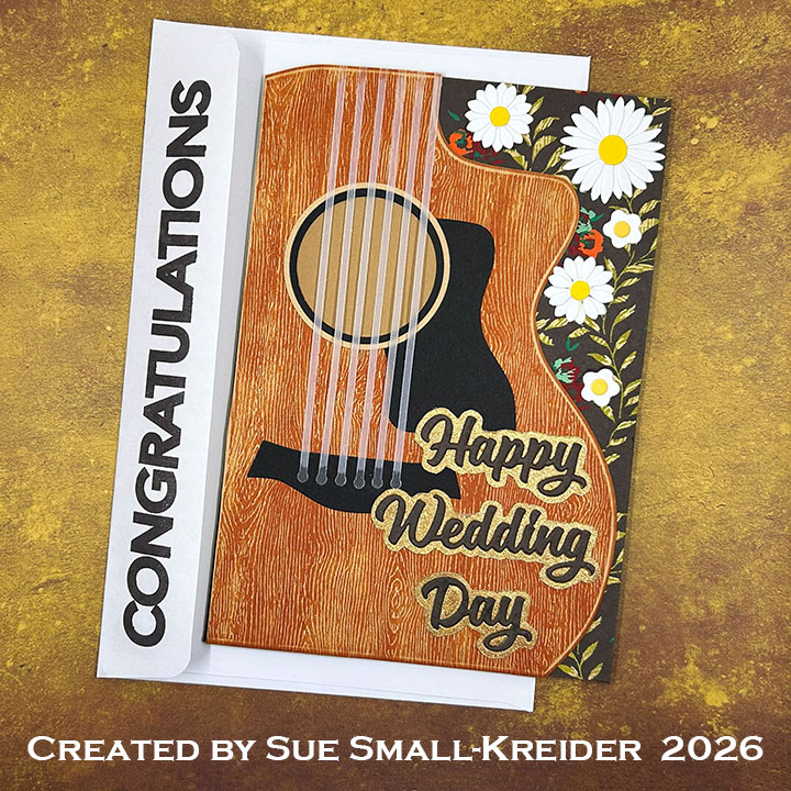
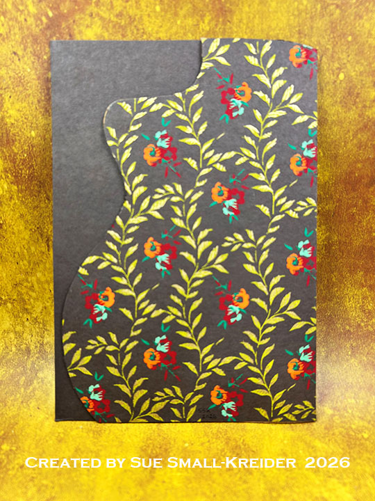
Card Front: Glued the finished woodgrain guitar to cardbase front matching up the curved edges and trimming off the excess along the fold. Then I cut a 5.5×8.5-inch rectangle of brown handmade floral paper and glued it to the inside of the cardbase as a backing to the card front. (I trimmed off the top left corner of brown paper following the guitar shape. I made white daisies in three sized using Karen Burniston’s Flowers and Bees die set and glued five daisies onto the brown paper along the guitar’s right edge.
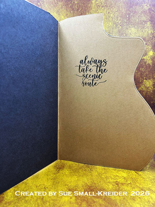
Sentiments: Karen Burniston’s Word Set 12 – Anniversary was used for the front sentiment “Happy Wedding Day.” It was die-embossed from a shed-less glitter paper then a shadow was fussy-cut around the words. The words were cut again from the backside of the brown floral paper and glued onto the gold shadows. Inside, the sentiment of “Always take the scenic route” from i-Crafter’s Wonderful World was stamped in dark brown ink.
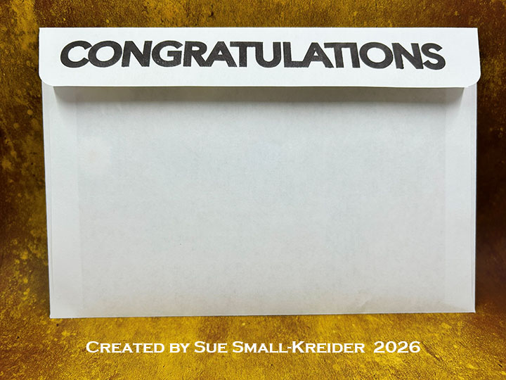
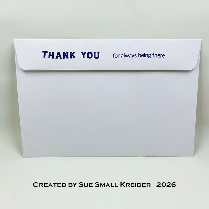
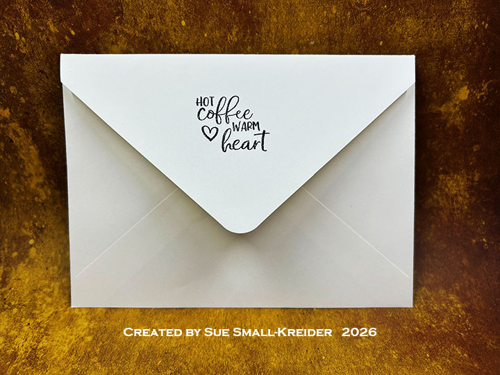
Envelope: The card fits into a catalog (6×9-inches) size envelope with “Congratulations” (by Simon Says Stamp!) stamped in dark brown ink on the back flap.
___________________________________
Thank you for experiencing this blog post.
I hope it inspires you and makes you smile.
Please subscribe, like and leave comments 😊
Follow my YouTube channel, Instagram and Pinterest as well.
___________________________________
Disclaimer: Karen Burniston products are provided free of charge by the manufacturer for review and use. All other items were personally purchased. Compensated affiliate links used where or when possible, meaning I will receive a small percentage commission from these manufacturers at no cost to you. This will allow me to add more content to my YouTube channel and help out a lot. Thank you.
Materials Used:
Dies
- Karen Burniston in cahoots with Riley and Company – Word Set 12 – Anniversary – 1137
- Karen Burniston in cahoots with Riley and Company – Flowers and Bees – 1026
- Paper Discovery by Olga Direktorenko – Music – Play On -Guitar & Violin
Stamps
- i-Crafter – Clear Stamps – Wonderful World
- Simon Says Stamp! – Clear Stamps – Slimline Greetings
Papers
- Memoryboxco.com – 8.5×11 Woodgrain Cardstock – Kraft
- Park Lane Paperie – 12×12-inch Artisan Handmade Paper – Brown Gold Vining Flowers
- Rainbow Splash – 8.5×11 Cardstock – Carmel
- The Paper Studio – 8.5×11 Vellum – Clear
- Glitter Cardstock – Gold
- Black Cardstock
- Catalog (6×9) Envelope – White
Ink
- Memento – Fade Resistant Dye ink – Espresso Truffle
- Ranger – Tim Holtz – Distress Ink- Rusty Hinge
- Pigma – Mircon 005 Fine Tip Pen – Black
Adhesives
- Neutral PH Adhesive by LINECO
- Fine-Tip Glue Bottle
- Double-Sided Tape – 1/4-inch wide
Tools
- Die Cutting Machine
- Paper Trimmer
- Bone Folder
- Stamping Platform
- Pajama Crafters – Pet Pig Press
- Stamping Blocks used as paperweights
- Scissors
- Ruler
- Paper Masking Tape