Needing a thank you card for a recent kindness from a friend, I made a life preserver pop-up card.
For this pop-up 3D card, I used products from Scrappy Tails’ new Nautical 2023 June Collection.
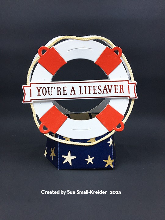
Base: Cut two of the Pop Up Stand from blue starfish cardstock from the Set Sail paper pad. Train the folds on each piece and glue tabs with slot for rubber band together. Add rubber band. (I used a #12 band.)
Preserver: Using the A7 Life Preserver die set, cut two preservers from heavy white cardstock as well as two sets of ropes. Cut a total of eight of the bands and C-rings from red. (I used packaging with a shinny coating). Ink the rope pieces before gluing to the preserver. Glue the C-rings to the preserver and then glue the bands over them. Pick a side of the preserver to be the top and add a line of glue across the back and adhere to the top back of the second preserver. Glue the life preservers to base.

Sentiment Banners: Three of the six hot foil banners in the Nautical Banner hot foil plates set were used – “You’re A Lifesaver” and “Thank You So Much.” (I usually do batch hot foiling with my Spellbinders’ Glimmer Foil System because it takes time to set-up, heat-up and cool-down.) The coordinating dies make the banners easy to cut out.

Envelope: The card folds flat to fit into an A7 envelope that I stamped the back flap with the life preserver from the Set Sail stamp set in red ink.
Thank you for reading this blog post. I hope this inspires you and makes you smile. Please like and leave comments 😊
Want to see more of the Scrappy Tails nautical collection? Check out my blog posts:
Materials Used:
Dies & Foiling Plates
- Scrappy Tails – Metal Craft Dies – A7 Life Preserver
- Scrappy Tails – Metal Craft Dies – A7 Pop Up Stand
- Scrappy Tails – Metal Craft Dies – Nautical Banner CD
- Scrappy Tails – Foiling Plates – Nautical Banner HF
Stamps
Papers
- Scrappy Tails – 6×6 Double-Sided Paper Pad – Set Sail
- Coated Red Cardboard Packaging
- White Heavyweight Cardstock
- A7 ivory Envelope
Foils:
- Spellbinders – Glimmer Hot Foil – Red
Ink
- Ranger – Tim Holtz – Distress Ink- Antique Linen
- Stampin’ Up – Classic Stampin’ Pad – Real Red
Adhesives
- Neutral PH Adhesive by LINECO
- Fine-Tip Glue Bottle
- Foam Squares
Tools
- Die Cutting Machine
- Stamping Platform
- LDRS – Stampendable Stamping Tool
- Stamping Cloth
- Sponge Dauber
- Craft Mat
- Scissors
- Spellbinders -Glimmer Hot Foil System
- Spellbinders – Quick Trimmer
Miscellaneous
- #12 Rubber Band