Thank you for joining the Karen Burniston Blog Hop for the August 2022 Release.
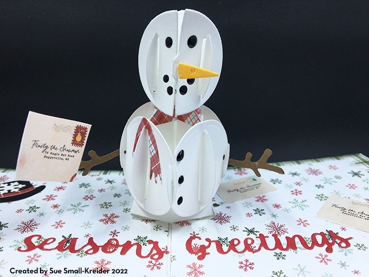
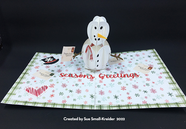
Such a joyful little snowman enjoying the snowy cozy Scandinavian countryside.

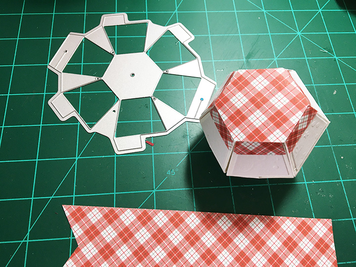
In her newest release, Karen Burniston has come out with some additional die sets that make putting together this snowman a snap. An add-on character set includes the top hat and band, carrot nose, large and small circles for eyes, mouth and buttons, as well as stick arms and a large snowflake. The Double-Ups for the all the pop-up balls have the side trapezoids linked together to cut 6 pieces all at once, so with the original individual trapezoid dies, you can cut all 12 side panels in one pass.


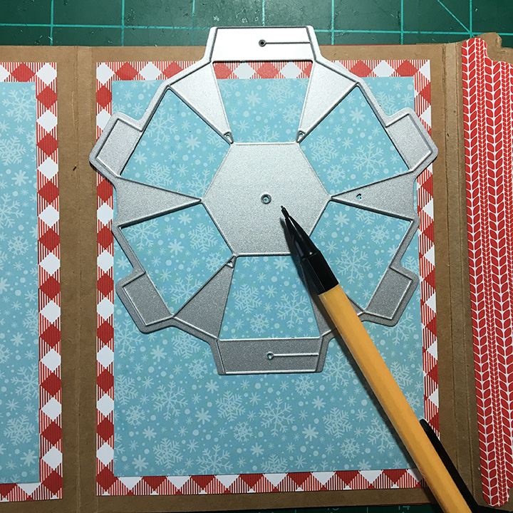
I started with a brown craft card base of 5 x 7 inches trimmed down to 5 x 6.5 inches. Next, the smaller side of the card was scored at 4.75 inches to form a gusset. Cut two of the Bitty Ball halves and two of the Mini Ball halves. I find watching the assembly videos for the balls very useful. (Bitty Balls, Mini-Balls) Numbering the order of gluing the tabs is useful for the assemble of the balls. I cut all the trapezoid panels from a white gold shimmer cardstock. And the ball halves are cut from a 100 lb. smooth white cardstock. Assemble the balls as shown on videos, including the brad in the bottom of the Bitty Ball.

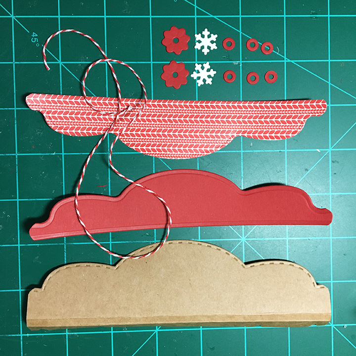

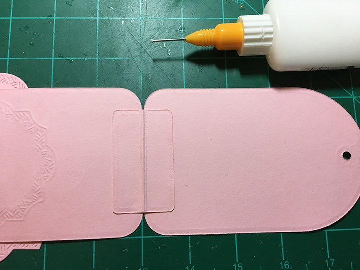
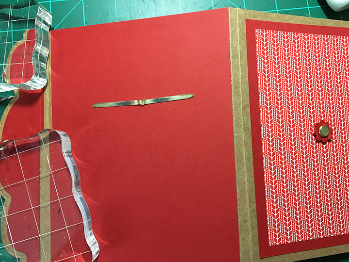
The decorative papers are two layers. The measurements are listed in the photo. (Flap assembly video) I cut the the flap from another craft card blank and two decorative panels from scraps of the decorative papers. The flap dies set cuts six washers of which three are glued together for each of the flower brad cover. Glue the front decorative panel onto the flap. Using a sharp piercing tool, punch a hole in the center of the flap.

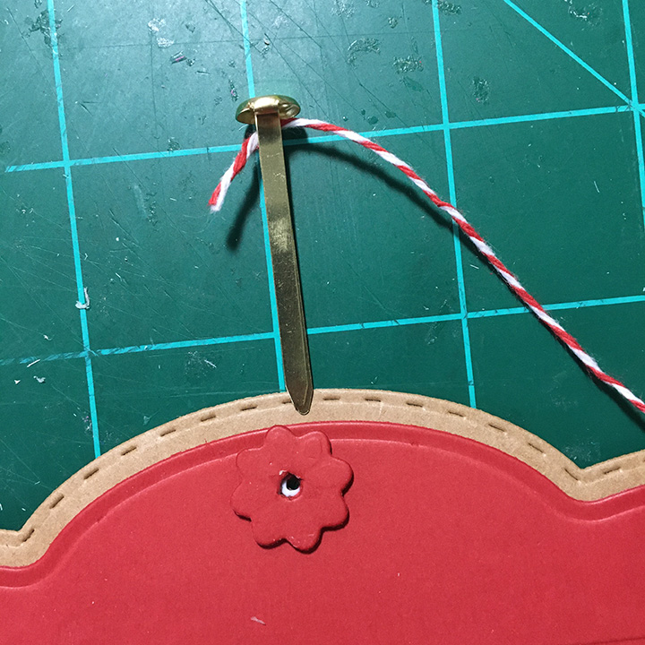
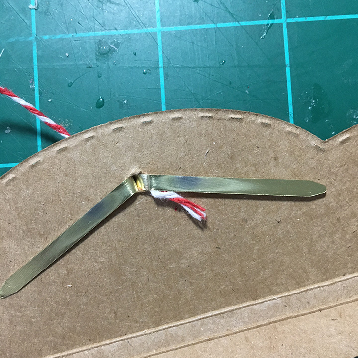
Glue the washers and flower over the hole. Thread the twine into the brad legs and pull the twine and brad legs through the hole. Bend the legs onto the back of the flap and glue the twine inplace on back of flap.
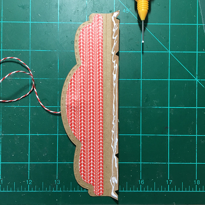


Glue the back decorative panel over the brad legs and twine. Glue flap tab to back of card base. Cover back of card and flap tab with decorative paper.


Glue the front decorative papers to the card front. Mark the center of the front of the card base with pencil and pierce. Glue the second washer and flower over the hole. Thread another brad through the hole and fold the legs against inside of card. Glue the inside decorative papers to the card base covering the brad legs.

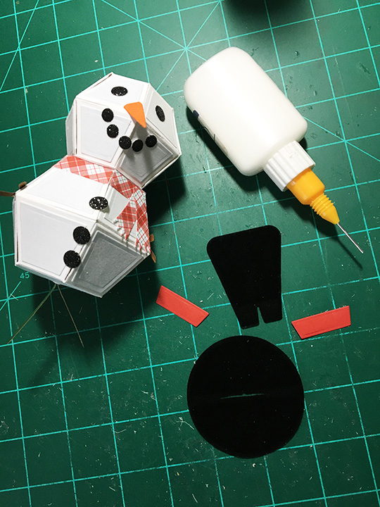
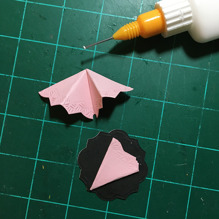
Adhere the snowman’s face. Glue the scarf pieces onto the bitty ball while flat. Cut a hexagon using the hexagon from the Surprize Ball Double-Up set or trace the center of the Bitty Ball die with a pencil and cut out. Assemble the top hat with a red hat band on front and back.


Mark the location of the hole to secure the snowman’s brad using the Bitty Ball die to fit within the card. Pierce the hole and thread the snowman brad through the hole. bend the brad legs to the back of the card. Glue the back decorative paper and white message label to cover the brad legs. Glue the hat onto snowman.

Decorate the front of the card using the faces from the Snowman, and Gnome and Santa sets Add the sentiment of “Merry Christmas” to inside. Large snowflakes are from the Snowman add-on set.

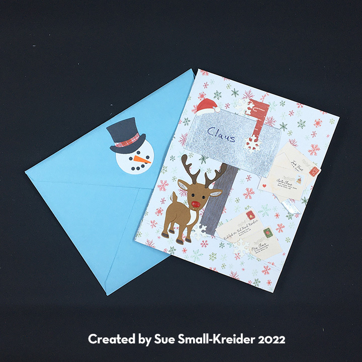
The card fits into an A7 envelope for hand delivery, but I would put the card in a padded envelope to mail.
Continue reading