Coffeeology

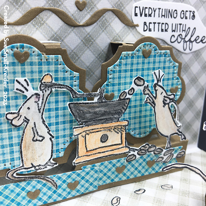
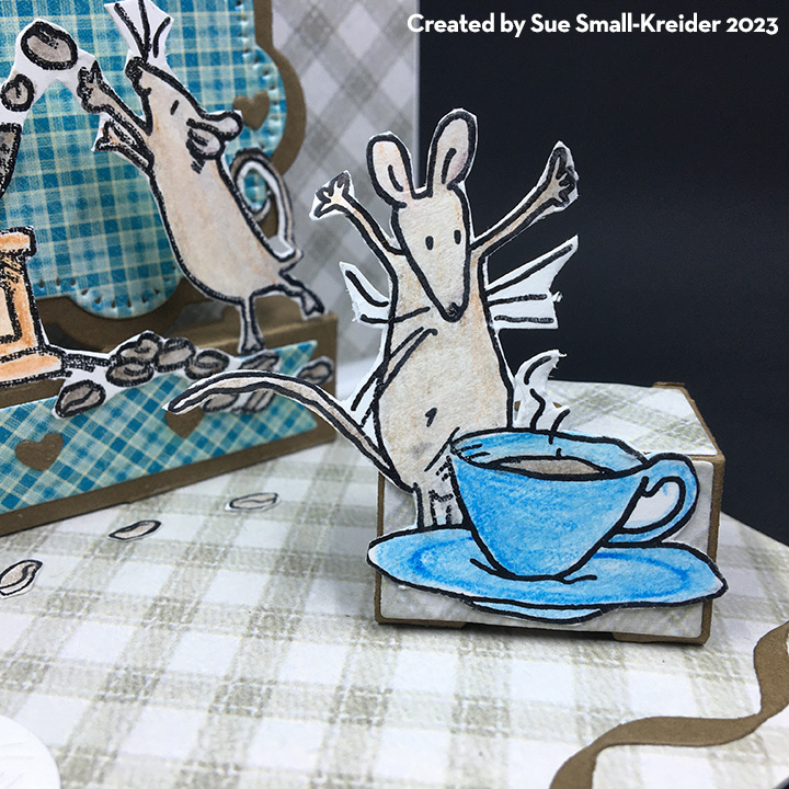
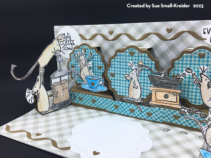
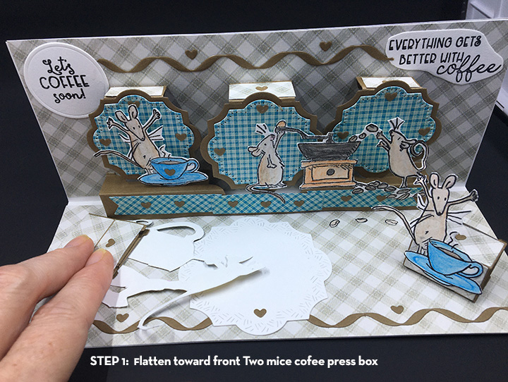
Some of us love the smell of a dark roast coffee. Others love a pumpkin spice latte. All of us need sometimes to just stop and smell the coffee and appreciate life. This is one of two coffee cards this week. Look for another tomorrow.

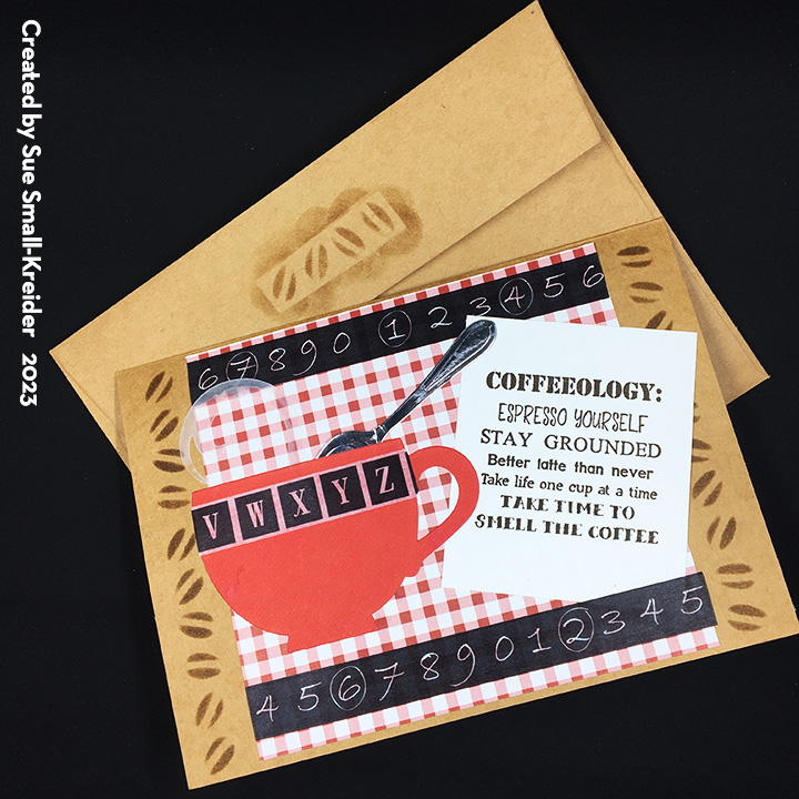
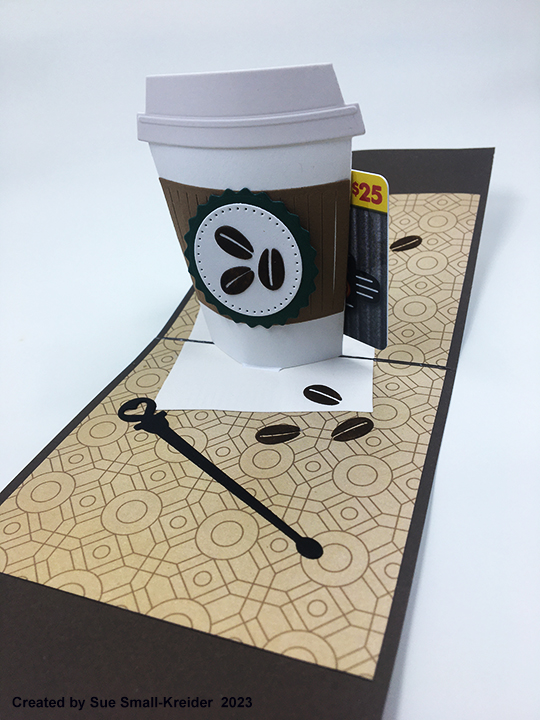
Designed around the Funny Bones Coffeeology rubber stamp on the card front, the inside pops up with a take-out cup of coffee that doubles as a gift card holder. All the dies used to make this card are by Karen Burniston.

I recommend watching the assembly video for the coffee cup pop-up before starting this card. The inside of the card mimics the card Karen Burniston demonstrates in the video for an A2 top fold card.

For the card front, I stamped the sentiment on a 3×3-inch square and glued diagonally over a 4×4-inch piece of decorative paper. The three tiny vessels of coffee come from the coffee charms die set. (See charm assembly video.) White steam was added using a medium tipped opaque white marker with detailed swirls of a white gel pen. Throughout the card there are inked coffee beans that were cut out of brown cardstock and covered using a mini cube of Distress Ink in walnut stain.The beans are in the coffee cup pop-up die set.

The card back has another 4×4-inch piece of decorative paper and is a place to write a lengthy personal message.

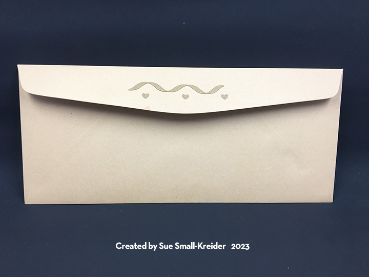
As is my style, the envelope back has a die-cut coffee mug with a heart that hints at what is inside.

See more coffee themed card by clicking here.

Thank you for reading this blog post. I hope it provides inspiration and joy. Please like and leave comments. 😊

Materials Used:

Dies

Stamps

Papers

  • Crafter’s Companion – 12×12 Double-Sided Paper Pad – Decadent Decor
  • Brown, White and Cream Cardstock
  • A2 ivory Envelope

Ink

Adhesives

Tools

  • Die Cutting Machine
  • Stamping Platform
  • LDRS – Stampendable Stamping Tool
  • Stamping Cloth
  • Sponge Dauber
  • Craft Mat
  • Scissors

Puppy Love

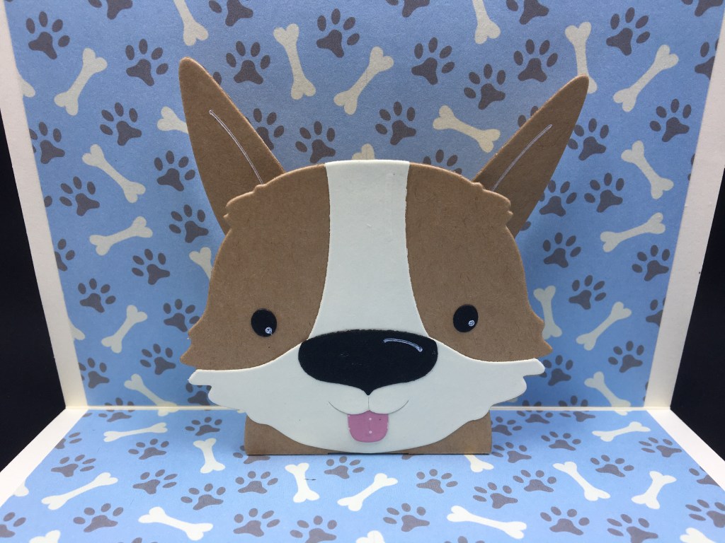
Puppy love… a dog in your life brings great joy. This is a card from a fur baby.

The adorable dog face with its moving ears, along with the front sentiment die and large paw print die-cut are all from Lynda Kanase’s i-crafter Puppy Face Wiper Inset set.

Watch the assembly video before putting together. The video recommends decorating the front and back of the card before adding items to the inside.

I masked off a banner on the front of the card using low tack paper tape. Next, I did a light spritz of a brown sparkle spray to create a sand like texture. Remove the tape and glue die-cut sentiment strip in place.

I used a left-over strip of decorative paper and two 1/8-inch tall strips of cream cardstock to finish the front of the card.

The card back uses another decorative paper scrap and a die-cut paw print that has its paw pads inked. I found that by attaching the tiny paws pads to a piece of low tack tape, I could easily ink the pieces with a sponge dauber.

I found that the puppy face dies have stencils within them that I used to ink with a white gel pen make highlights.

I added the “love you” inside the card using a Karen Burniston word set.

As with all my cards that are sent in an envelope, I have decorated the back flap with an embossing folder and a paw die-cut. Both the embossing and die-cut were inked with a dark brown ink. The card fits into an A6 envelope.

Thank you for reading this blog post. I the card made you smile and gave you inspiration. Please like and leave comments 😊

Materials Used:

Dies

Papers

  • & Papercraft, issue 204 – Pawfect Pals designed by Adam Prescott
  • Brown Craft and Cream Cardstock
  • Blue, Pink and Black Cardstock Scraps
  • A6 Card and Envelope – Ivory

Inks & Pigments

  • Nuvo Sparkle Spray – Coca Powder
  • Ranger – Tim Holtz Distress Ink – Walnut Stain
  • Sakura – Gelly Roll 08 – Gel Pen – White

Miscellaneous

Shop Cards – Coffee and Books

Miniature houses and shops fascinate me. When I saw that Concord & 9TH had come out with a Pop-Up Shoppe Die set and add-on sets for a bakery and a bookstore, I knew I had to try them.

First try – Bookstore
Second try – Coffee/Bake Shop

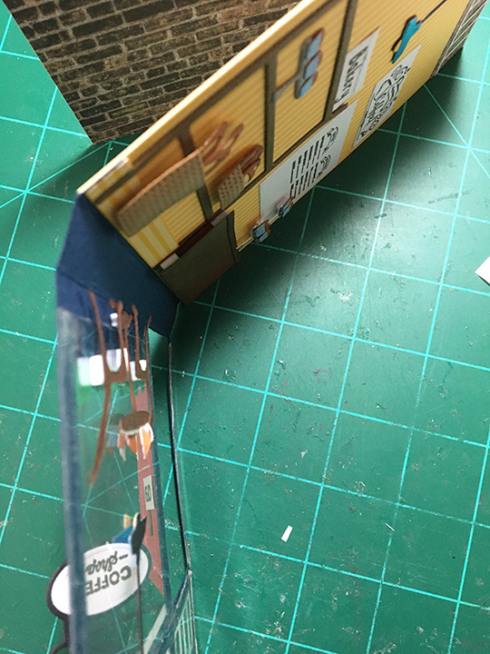
Here are my first and second cards that I made from these die sets. The first one, a bookstore, was done without watching the assembly video and hence I attached the pop-up store front as an accordion fold rather than the “U” pop-up fold as the video shows. The second one, a coffee/bake shop, uses the “U” fold. (Bake shoppe video, Book shoppe video)

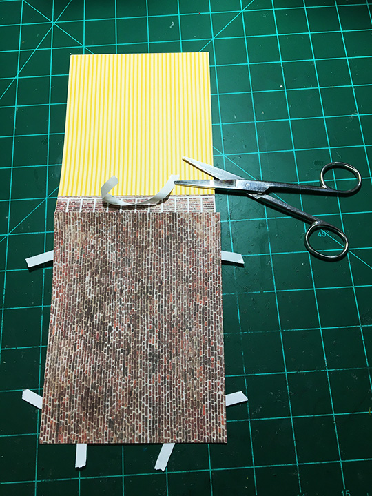
For the coffee/bake shop I cut a 4.25×5.5-inches piece of banana cream cardstock folded in half for a top fold A2 size card base. using double-sided tape I adhered the decorative papers on all but the front inside of the card.

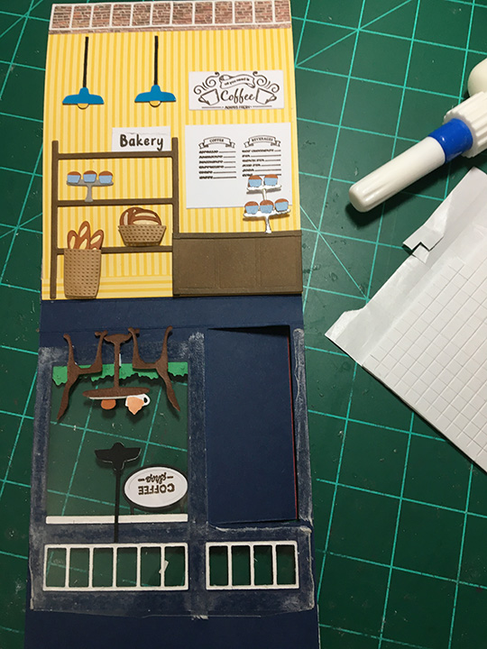
I found that assembling the shop front from the acetate windows, door and, flower box and eaves dental molding first, made it easier to plan how to lay out the inside scene. On the coffee/bake shop I used the largest door die to do a partial die-cut of three sides on the shop front, so that the door could be opened. (I’ve also thought for my next card to use both door dies to cut in windows to the door.)

The acetate windows can be one large piece if you don’t make the door open or two or three pieces if you do cut the door to open. (I reinforced the narrow strip by the door with a piece of acetate.) You need the acetate to glue the window frames onto as well as tables and lights bumped out with foam squares.

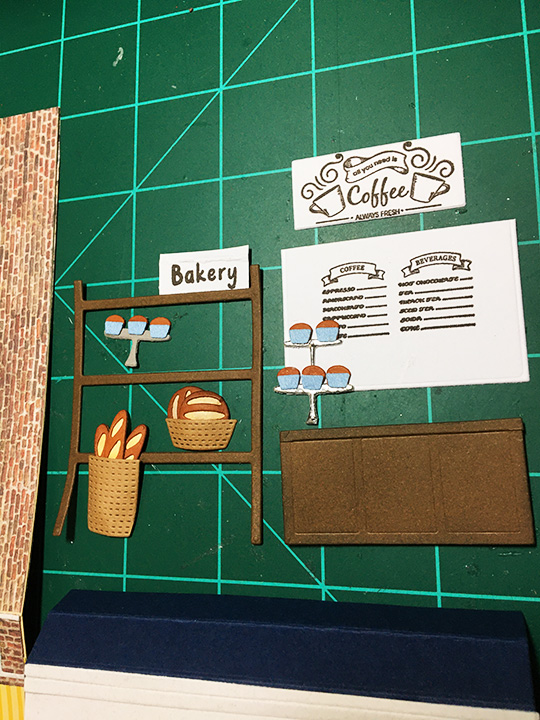
The inside decor for the coffee/bake shop uses the bake shoppe dies as well as the counter made from the bookstore’s cabinet with the shelves cut off. The stamped coffee signs come from a coffee shop stamp set from My Favorite Things. The “OPEN” sign on the door is from a Lawn Fawn stamp set. “Bakery” is part of the Concord & 9TH stamp set.

All of the coffee and bakery elements were curved using fingers or flower shaping ball tools. The breads and baskets were inked with Distress inks. Printed watercolored papers were used for other elements like cups and flowers. Foam squares are used to adhere most of the elements to the card back.

Placement of items to be seen through the upper windows and open door may make the inside layout seem off-balance.

The inside of the card needs layers of matted sentiment and a decorative paper on the card back to balance out the weight of the card front.  I think the top fold card works best for the card design, but the side fold card is good too.

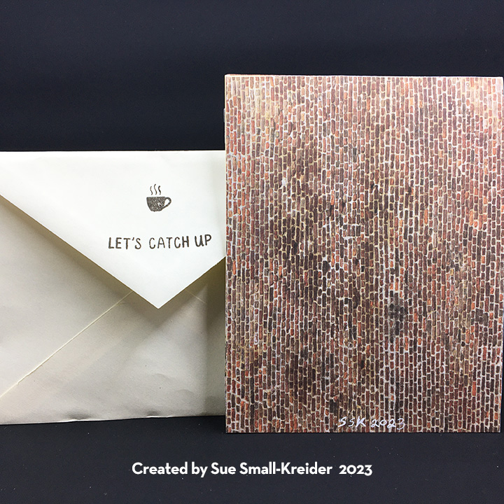
As is my way, I decorated the back flaps of both A2 envelopes with stamps from Hero Arts (bookstore) and Concord & 9TH (coffee/bake shop) to hint as to what is inside the envelope.

See more coffee themed cards by clicking here or shop cards click here.

Thank you for reading this blog post. I hope it brought you comfort and inspiration.  Please like and leave comments 😊

Materials Used:

Dies

Stamps

Papers

  • Clear Acetate Sheet
  • Craft Consortium – 6×6 Premium Paper Pad – Brick Textures
  • My Favorite Things – 6×6 Paper Pad – Finishes and Textiles
  • Funky Fossil Designs – 20cm x 20cm Paper Pad – Watercolour Rainbow
  • Fun Stampers Journey – 8.5×11 Cardstock – Banana Cream – CS-0087
  • White A2 Card Base
  • Colored Cardstock
  • Colored, Pattern and Foiled Paper Scraps
  • A2 Envelopes

Inks & Pigments

  • Ranger – Tim Holtz Distress Inks – Walnut Stain and Soot Black
  • Stampin’ Up – Classic Stampin’ Pad – Early Espresso
  • Pigma Micron 01 – Black
  • Sakura – Gelly Roll 08 – Gel Pen – White

Miscellaneous

  • Neutral PH Adhesive by LINECO
  • Fine-Tip Glue Bottle
  • Scrapebook.com – Double-sided Tape – 1/4-inch wide
  • Die Cutting Machine
  • Stamping Platform
  • LDER Creative – Stampendable Stamping Tool
  • Stamping Blocks
  • Sponge Daubers
  • Piercing Tool
  • Tweezers
  • Foam squares

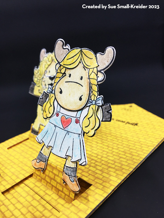
We’re Off To See The Wizard!

Sometimes it just feels like we’re off to see the Wizard of Oz to get all our problems solved. But what we learn as we traverse the road, it’s the people we meet along the way that mean more to us than the real issue.

This is a card to let the friends you meet along the journey know you appreciate them. It uses stamps and dies by Riley and Company to recreate the characters from the movie, The Wizard of Oz. Riley of course is a moose, so it’s moose in OZ costumes.

I stamped Riley four times and then stamped the costumes for the Tin Man, Lion, Scarecrow and Dorothy from the two Oz Dress-Up sets and Toto too. Watercolor pencils were used to color the individual pieces before die-cutting out the colored pieces. I found that cutting apart the bodies made it easier to assemble the costumed moose allowing for feet and arms to be positioned in more interesting ways. (The dies cut very close to the stamped images and are very easy to line-up.)

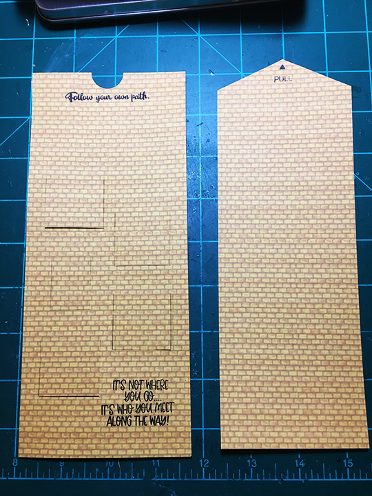
Using a download template that I had created for other cards using multiple sliders I first printed by yellow brick paper on medium weight white cardstock and then printed the template on the back of the yellow brick paper.

I had to edit the template, x-ing out some sliders and moving two others by half an inch to accommodate the size of the moose.  Using a metal ruler and craft knife I cut the red lines around each slider and then scored the blue and green lines before folding the sliders.

Before assembling the card, I stamped the sentiments on to the card front and the interactive directions on to the pull tab of the main slider piece.

Double sided tape was added to the thin tabs on the five multi-sliders. To adhere the card front to the card back, I used narrow strips of foam tape along the sides and bottom edges. Place the main slider piece with the print side down to adhere the multi-slider panels to it. Making sure it can slide between the foam tape. Peel off foam tape backing and adhere the card back.

Turn to the front to train the multi-slider panels to slide open and close. Glue figures on to the panels.

Decorate the back of the card with scraps and you can write your personal message there.

As is my usual, I stamped the envelope flap back to hint as to what is inside. I used the ruby slippers and the “Where are my freakin’ ruby slippers when I need them?” which came-out upside-down and I think sets the card up nicely for the journey.

Hope you enjoyed the card and found inspiration from it.

Here are more split easel slider cards I’ve blogged about:

Thank you for reading this blog post. Please like and leave comments 😊

Materials Used:

Dies

Stamps

Inks & Pigments

  • StazOn Solvent Ink – Jet Black
  • Ranger – Tim holtz – Distress Water Color Pencils – Sets 1, 2 & 3
  • American Crafts – Metallic Marker – Silver
  • Pigma Micron 01 – Black

Papers

  • Yellow Brick Road designed by Whimzwhirled
  • White Cardstock
  • #10 Business Envelope – Brown Craft

Miscellaneous

Floral Thoughts

For this card I used a floral window die and stamp set by Memory Box that was the gift with issue 97 of the Die-Cutting Essentials magazine. The die makes an image using tiny holes and cuts out the aperture inside the wreath. I die-cut it on a 5.5 x8.5 piece of heavy pink cardstock and then stitched it completely before trimming it down to the final 5.5-inch square to fit on a 6-inch square cardbase.

Using the needle, enlarge the holes before stitching. The larger flower petals and leaves were outline or chain stitched before filling in the centers of them using two strands of floss. The yellow stamens are French knots.

The accompanying sentiment stamps provided the “Thinking of You” was heat embossed directly to the back mat after determining the placement with the stitched frame. The frame was attached to the 6-inch square of patterned paper with thin foam squares.

If you enjoyed this stitched card, there are more stitched card posts on this blog site:

Thank you for reading this blog post. Please like and leave comments 😊

Materials Used:

Dies & Stamps

  • Memory Box – Floral Window All-Occasion Die & Stamp Set – Die-Cutting Essentials, issue 97, December 2022

Ink & Embossing Powder

  • Clear Emboss & Watermark Ink
  • Gold Embossing Powder

Papers

  • Pink Heavy Weight Cardstock
  • Queen & Co. 6”x 6” Mat Stack – Candy Land

Miscellaneous
  • Yellow, Pinks, & Green Embroidery Floss
  • Large Eyed Needle
  • Foam squares
  • Die-Cutting Machine
  • Stamping Platform
  • Heat Tool

Brr, It’s Cold Outside!

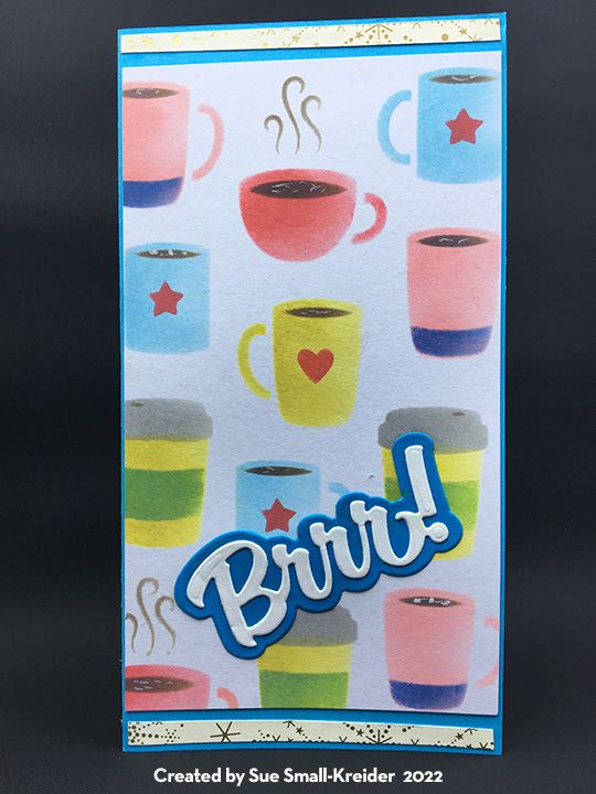
Sometimes it’s nice just to watch it snow with a warm cup of coffee or hot coco.

This fun mini-slim sized card is a blend of stenciled coffee cups and a die-cut snowflake collage pop-up. All the dies used are by Karen Burniston while the layered stencil is by Pretty Posh Pink. The coffee cups by both designers are similar in size and work well together.

I went through all my Karen Burniston die sets to find as many different single snowflakes as possible to use for the swirling collage mechanism inside the card. (I recommend watching the assembly video before starting your card. The video has useful tips and card base minimum sizes that will help you design your card.)

The sentiments all come from Karen Burniston’s Word Set 13 – Snow and include the shadow dies for the large words of “Brr!” and “Snow.” The mug and travel coffee cup inside are all die-cuts inked similar to the stenciled ones on the card front.

As with all my cards that are sent in an envelope, I have decorated the back flap with a hint of what’s inside. This time I stenciled a coffee mug on the flap.

See more coffee themed cards by clicking here.

Thank you for reading this blog post. Please like and leave comments 😊

Materials Used:

Dies

Stencils

  • Pretty Pink Posh – 6×6 Stencil – Layered Coffee Cups

Ink

  • Ranger – Tim Holtz – Distress Oxides – Festive Berries, Saltwater Taffy, Ground Espresso, Pumice Stone, Hickory Smoke, Mowed Lawn, Crushed Olive, Prize Ribbon and Tumbled Glass

Papers

  • Stampin’ Up – 6’ x6” Specialty Designer Series paper – Lights Aglow
  • Blue and White Medium Weight Cardstock
  • Simon Says Stamp – Mini Slimline envelope – Grocery Gag

Miscellaneous

Mountain Train Ride

There is nothing so relaxing as a train ride through the mountains. Seeing the pine trees at the higher elevations and the babbling streams in the gullies. Hearing the chug-chug-chugging of the steam engine and experiencing the darkness of a mountain tunnel coming back into the sunlight.

In my challenge to myself to see how many different themed cards I can make with Karen Burniston’s new Fireplace die set; I decided on a mountain train tunnel with the mouth of the tunnel using the fireplace mechanism’s opening. All the dies used are by Karen Burniston.

I had made multiple train cars and engines for an earlier project. (Watch the assembly video for the trains.) The train tracks are from a train elements set and I cut 4 of them to have enough pieces to form the track I needed for the front and inside of the card. For the smoke from the smokestack, I turned the smallest cloud from the Outdoor Scene set on its side and glued inside the stack.

The front of the card uses curving hillside with large pine trees from the Outdoor Scene set and the treeless curving stitched edger from the Long Nature Edges set for the foothills. I shaded the hillside tope edges with a pale brown ink.

For the card’s sentiment, I double cut the large words “Enjoy” and “ride” once from brown and again from black so that I could offset them to create a shadow. The oval cuts out the word “THE” so it is backed with a scrap of black.

The inside of the card requires some practice laying out to get the right placement of the mountains, so they won’t stick out of the card when closed. (Watch the fireplace assembly video before laying out and assembling.) I used scrap pieces of brown lightweight cardstock to cut my crosshatch ovals. (Largest oval die in set was used.) I cut off the bottom of the ovals to have varying heights. The largest oval I turned over on the back, traced the mechanism opening onto and then die-cut the opening using the second to smallest to fit inside the penciled opening.

The smaller ovals are glued to the sides and behind the oval with the tunnel opening. I then adhered the fireplace mechanism as shown in assembly video and glued the mountains onto mechanism matching up the openings. Next, I pieced together the train tracks to come out of the tunnel and near the side of the mountains. Using the pop-up strip from the Fireplace die set and the two angled pop-ups from the Mini Pops set, played with placement of the pop-ups with the train pieces to set spacing.  Glue the pop-ups first and once their glue has set, then adhere the train pieces. (I bent the pop-ups at their original scored folds, but you might play with other folds and or strips to get a more realistic alignment of the train cars.)

The babbling stream is created from strips of patterned paper cut with the Long Nature Edges curving stitched edger. The diagonal placement adds drama to the card and space in the corner to write a personal message.

Leftover pieces from the train track as well as pieces from other card projects complete the back of the card.

As is my habit, I decorated the envelope back flap with additional train pieces to hint at what’s inside.

Thank you for reading this blog post. Please like and leave comments 😊

Materials Used:

Dies

Papers

  • Colored, coated and glitter cardstock and patterned paper scraps
  • American Crafts – 5 x7 Kraft card & A7 envelope

Inks

  • Green fine-tipped marker
  • Ranger – Tim Holtz -Distress Ink – Antique Linen

Miscellaneous

Staying Out of The Doghouse

Pets are great companions and always eager to greet us when we come home. This card is for a pet to their owner who is recuperating from an illness.

For this card, I’ve used two die sets from the August 2022 release by Karen Burniston Fireplace Pop-Up and Word Set 15 – Just Because. The fireplace is the lower half of the doghouse with half a crosshatch square for the roof.  (I highly recommend watching the assembly video for the fireplace before starting the card.)

The fireplace mechanism is also used to make the doghouse pop-up. You need to adhere it first before assembling the doghouse. You will need a 5×7 inch card base.

To make the doghouse, I cut the medium crosshatched square diagonally to have a triangle. You should glue the triangle onto the fireplace base so that the height of the house is 4.5 inches high. (I had to trim off the tip of the house to fit into the card when assembled onto the mechanism.)

I cut strips of the blue cardstock to become siding on the house. Start gluing strips on at the bottom and overlap them to cover the house, trimming the siding on the triangle to fit the slatted roof eaves.

Use the cut out from the fireplace to make a sign for the doghouse. Using a brown ink, rubbing ink on a sponge from the bottom to top to weather the house.

To create the eaves, use the medium crosshatch square with the next size down square to cut a square frame. Then snip at opposite corners to from two crosshatch eves that cane be glued together and then glued over the eaves and siding on the house.

Glue the house to the mechanism matching up the opening.  Decorate with grass, clouds, sun from various nature decorative die sets by Karen Burniston. The puppy and dog dish with bone are from her Cat and Dog set. (See assembly video for the dog.) They are made to pop-up away from the house using the small pop-up mechanism from the fireplace set. (You could also angle them using KB’s Mini Pops Pop-Up die set.)

The sentiments are from two die sets – Word Set 15 – Just Because and Word Set 10 – Thinking of You.

For the front of the card, I used a rectangle of plaid paper cut a half-inch smaller than the card dimension and used a fine tipped black marker and metal ruler to draw two lines around the paper to frame it. White stich marks were added to the plaid paper with a white gel pen.

The sentiment is another of Karen Burniston’s die sets called Home Sweet Home. The grass and dog were left over from the inside of the card and the hearts are from the “Os” in the front sentiment.

The envelope flap is stamped with a Lawn Fawn stamp with dogs and other critters to hint at what’s to come inside.

Thank you for reading this blog post. Please like and leave comments 😊

Materials Used:

Dies

Papers

  • Colored cardstock and patterned paper scraps
  • American Crafts – 5 x7 Kraft card & A7 envelope

Pens, Crayons, Inks & Coatings

  • Sharpie – Permanent Marker – Ultra Fine Point – Black
  • Sakura – Gelly Roll Pen– 08 -White
  • Memento – Fade-Resistant Dye Ink – Tuxedo Black
  • Ranger – Tim Holtz -Distress Ink – Vintage Photo

Stamps

  • Lawn Fawn – Simply Celebrate Critters

Miscellaneous

JUST SEWING A HELLO

Karen Burniston Design Team September Challenge “JUST…”

Just sewing a hello to you all. The fun new sewing charms from Karen Burniston’s August 2022 release make for a cute card.  Paired with the Label Charm Pop-Up and Word Set 15, this 4.25×5.5-inch card is a quick make. 
I started with a 4.25-inch by 11-inch card base folded in half. Using double-sided tape, I covered the inside and outside panels with yellow and blue plaid paper. (My favorite technique for using double-sided tape is to place around the edge of the card, lift the ends of the tape so corners are sticky, position the covering paper, you can shift the top paper a bit before you pull all the tape backing paper strips.)

Since I used 6-inch by 6-inch paper, I opted to trim it to size after adhering it to the card.

I centered the pivot label charm pop-up die over the front of my card and die cut through all three layers of paper and cardstock. Because of its thinkness, I ran it throught my die cutting machine twice. 

Because I did not adhere the center of my decorative papers to the card base, when I die cut the front label pivot, I could snip away the decorative labels from the paper and use them to decorate my card.

I cut two blue and one yellow tabbed labels. One of the blue labels, I glued the tab to the back of the yellow label and the adhered the other blue label over the back of the yellow label to hide the glued tab. Next, I used the label frame die with the hole to cut the frame from which the charm will hang from the double decorative papers side. Mark the hole to be pierced before cutting. (I would adhere the charm to the frame using a metal jump ring at this point, but you can add it as I did after the frame and label is glued into the card. It is harder to manipulate once the card is assembled.)

Fold the charm frame and attached label together as they will go into the card. Place a drop of glue on the frame’s tab and adhere to the back side of the card front label. Glue the blue label to the inside card back panel.

I cut three white charms. Two of the charms I cut the dotted oval from to form a charm frame and an oval. I stitched around the center oval of the charm with blue embroidery floss. To assemble glue the charm frame to the solid charm and then adhere one of the stitched ovals. Turn solid charm over and repeat.

I used four word sets for this card. The word sewing, I had to splice together from the words “wish” and “sending.” “Wish” is from Word Set 2. “Sending” is from Word Set 14. You can see in the photograph the sections circled in red where glued together to form the word “sewing.”

“Just” is from Word Set 15 and “Hello” is a single large die that embossed the stitch marks for you to color in with a fine -tipped marker.

The sewing charms (assembly video) can have their loops cut off and glued in place. I free-handed the stitch marks around the label and the label window with white and blue fine-tipped pens. For the back of the card I used the white waste from cutting the front pivot label to frame, and the leftover yellow label also cut from the front. The button and thimble cover the gaps in the frame.

As with all my cards that are sent in an envelope, I have stamped the back flap to hint at what’s inside. This is an A2 envelope. The card will require extra postage in the USA because of the thickness and the added metal charm may mean I’ll send the card in a padded envelope.

Thank you for reading this blog post. Please like and leave comments 😊

Materials Used:

Dies

Papers

  • Catherine Pooler – Zen Plaid 6×6” Pattern Paper
  • Silver packaging
  • Blue and white cardstock scraps
  • White gold shimmer cardstock
  • Light weight white cardstock base 4.25 x11 inches folded in half
  • A2 white envelope

Pens, Inks & Stamps

Miscellaneous