Vintage Christmas Cards – Room Scene

Recently I came across some family Christmas cards I had designed with the help of my father who owned a letterpress printing press and had cuts (think metal stamps on wooden blocks similar to rubber stamps on wood blocks) made of my drawings. The printing press held an 8×10-inch frame which held the cuts and metal type (letters). Paper was hand-fed into the press which had an electric motor connected with a leather belt which turned the press wheel. From about age 8 and on I earned pocket money running the press to add people’s names to their store-bought Christmas cards, “From the Desk of” notepads and other small print jobs from family and friends.

The five cards that I am sharing this week were created before the computer drawing program Auto-CAD was widely available to individuals. (I know we didn’t have access to digital type fonts that Apple computers offered around that time.) I used rulers, India ink pens and protractors to draw the pop-ups.

In 1985 I designed a pop-up room scene featuring a fireplace tabletop Christmas tree and a cat. I used rub-ons that were popular at the time to created graphics. All the straight lines were rub-ons as well as the letters on the garlands. I used a plastic drawing template for the circles and arcs. The cat was a sticker that had been reduced on a photocopier.

These postcards were hand-colored with watercolors and markers.

On the back of the postcard was the first of my CRX drawings that showed how the finished pop-up should look along with cutting and folding instructions.

I believe this was the last of the family designed Christmas cards as my father discovered Graphics3, a family-owned printing business in Jupiter, Florida that made 3D pop-up cards and began ordering from cards from them.

Here are other vintage Christmas cards:

  • Room Scene

Vintage Christmas Cards – Sleigh

Recently I came across some family Christmas cards I had designed with the help of my father who owned a letterpress printing press and had cuts (think metal stamps on wooden blocks similar to rubber stamps on wood blocks) made of my drawings. The printing press held an 8×10-inch frame which held the cuts and metal type (letters). Paper was hand-fed into the press which had an electric motor connected with a leather belt which turned the press wheel. From about age 8 and on I earned pocket money running the press to add people’s names to their store-bought Christmas cards, “From the Desk of” notepads and other small print jobs from family and friends.

The five cards that I am sharing this week were created before the computer drawing program Auto-CAD was widely available to individuals. (I know we didn’t have access to digital type fonts that Apple computers offered around that time.) I used rulers, India ink pens and protractors to draw the pop-ups.

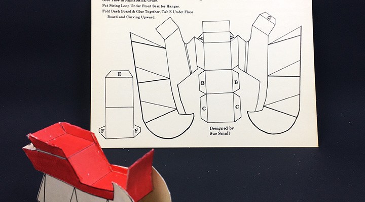
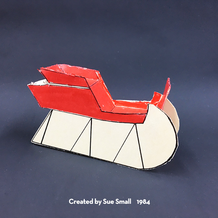
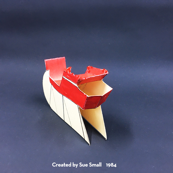
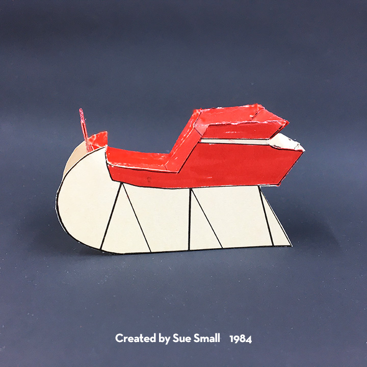
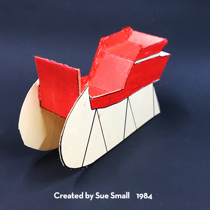
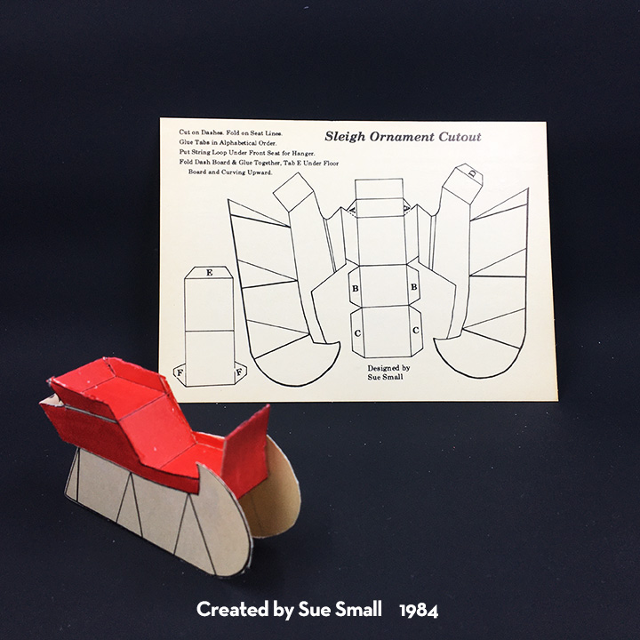
My siblings and I think the sleigh postcard was created around 1984 using an image found in a Dover Publications clip art book. (We didn’t document our source as it was an image in the public domain.)

The sleigh was manipulated on a photocopying machine. The image was cut-out twice and one image flipped on its back side and traced with an ink pen. A ruler and protractor were used to create the rectangular shapes and tabs that connected the sides. Rub-on lines were used to create the various thickness of lines and perfect corners.

The instructions, title and tab letters were printed using hand-set type and the cut and pasted onto the drawing. (You can see one of the “F” tabs shows the overlap of paper covering the line.)

These postcards were hand-colored using red makers. We printed 400+ of these cards starting in October.

A few of our friends said they had cut and assembled the sleigh.

Here are other vintage Christmas cards:

  • Sleigh

Vintage Christmas Cards – Fireplace

Recently I came across some family Christmas cards I had designed with the help of my father who owned a letterpress printing press and had cuts (think metal stamps on wooden blocks similar to rubber stamps on wood blocks) made of my drawings. The printing press held an 8×10-inch frame which held the cuts and metal type (letters). Paper was hand-fed into the press which had an electric motor connected with a leather belt which turned the press wheel. From about age 8 and on I earned pocket money running the press to add people’s names to their store-bought Christmas cards, “From the Desk of” notepads and other small print jobs from family and friends.

The five cards that I am sharing this week were created before the computer drawing program Auto-CAD was widely available to individuals. (I know we didn’t have access to digital type fonts that Apple computers offered around that time.) I used rulers, India ink pens and protractors to draw the pop-ups.

For the 1983 stand alone fireplace, I know I was influenced by the cardboard fake fireplaces that were popular Christmas decorations in my childhood. The mantel design may have come from family homes or other 1920’s bungalow style homes with brick fireplaces. It is a more complex assembly with many smaller pieces. I remember printing the instructions and tab names with hand-set type and then cutting and pasting them onto the drawing, before sending it all off to be made into a metal cut.

My father had a little more experience with creating the colors using rub-on sheets of dots to create the coloring of sections of the drawing. Using a photocopying machine, he reduced the size of the dots to make them more intense and he did a reverse of the dots and space in between for the fire. Then he had three cuts made – one for the black drawing, one for the green stockings and mantel greenery and the last one for the red bricks and fire.

For one postcard, it took four runs through the printing press. We printed 400+ of these cards starting in October.

A few of our friends said they had cut and assembled the tiny fireplace adding the suggest string loop to make it a Christmas ornament.

Here are other vintage Christmas cards:

  • Fireplace

Vintage Christmas Cards – House Box

Recently I came across some family Christmas cards I had designed with the help of my father who owned a letterpress printing press and had cuts (think metal stamps on wooden blocks similar to rubber stamps on wood blocks) made of my drawings. The printing press held an 8×10-inch frame which held the cuts and metal type (letters). Paper was hand-fed into the press which had an electric motor connected with a leather belt which turned the press wheel. From about age 8 and on I earned pocket money running the press to add people’s names to their store-bought Christmas cards, “From the Desk of” notepads and other small print jobs from family and friends.

The five cards that I am sharing this week were created before the computer drawing program Auto-CAD was widely available to individuals. (I know we didn’t have access to digital type fonts that Apple computers offered around that time.) I used rulers, India ink pens and protractors to draw the pop-ups.

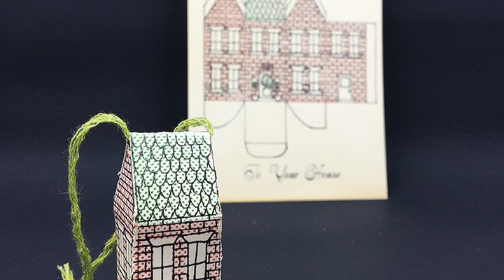
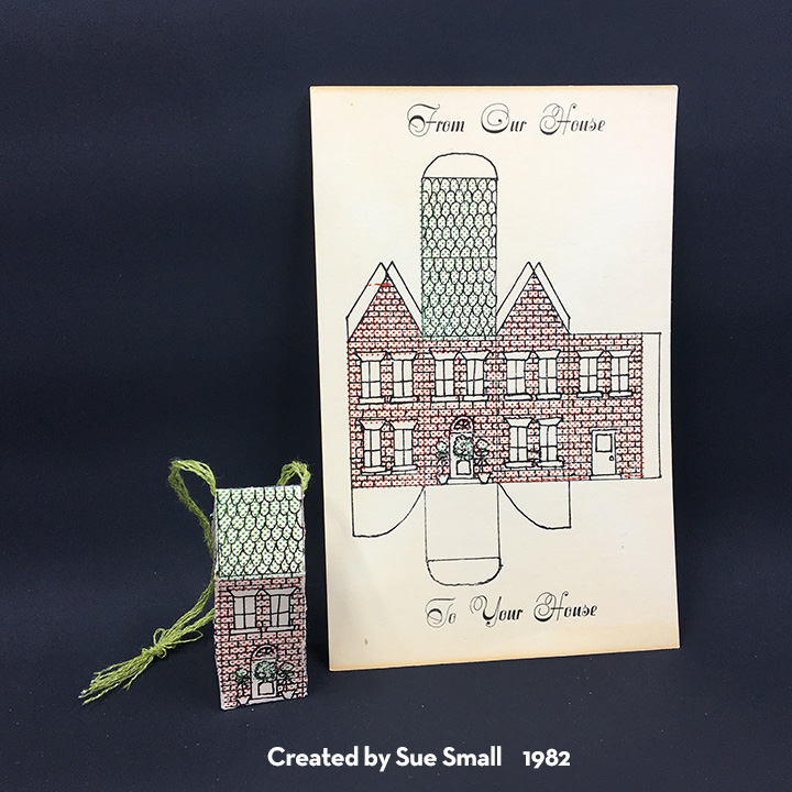
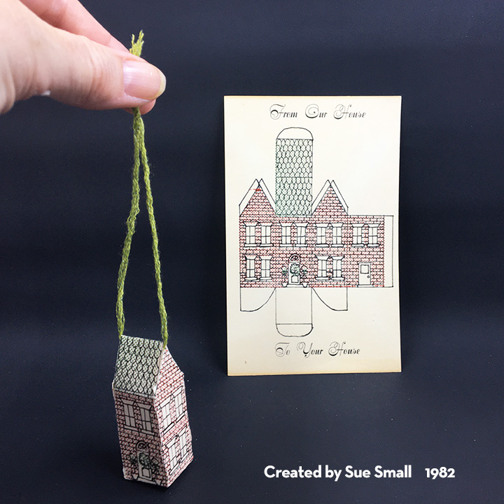
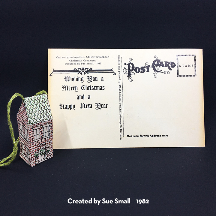
The 1982 “From Our House To Your House” house box postcard was an outgrowth of my fascination with creating house boxes. I had been introduced to box making in a high school commercial art class where I created a blue and white farmhouse box for perfume. At college I expanded on the farmhouse box design by creating a cardboard embossing plate to add raised clapboard siding and roof shingles that was run through an intaglio press. In 1981 I had completed an internship at a historic house museum which was a red brick Victorian house.

The challenge with creating a house box on a postcard was how much would fit on a 5 3/4-inch x 3 3/4-inch postcard. I drew the box on an 8 1/2-inch x 11-inch sheet of paper and used a photocopying machine to reduce it in size.

My father was experimenting with a new technique for him using rub-on sheets of dots to create the coloring of sections of the drawing. He had three cuts made – one for the black drawing, one for the green roof, door wreath and greenery and the last one for the red bricks.
For one postcard, it took four runs through the printing press. We printed 400+ of these cards starting in October.

A few of our friends said they had cut and assembled the wee house box adding the suggest string loop.

Here are other vintage Christmas cards:

  • House Box

Mother’s Day Keepsake Card

Recently I received a commission to make a Mother’s Day card that was to have all four of her children’s birthdays and names on it. The recipient likes gardening, traditionally receives flowers on Mother’s Day to plant in her garden and may soon be moving to a new home.

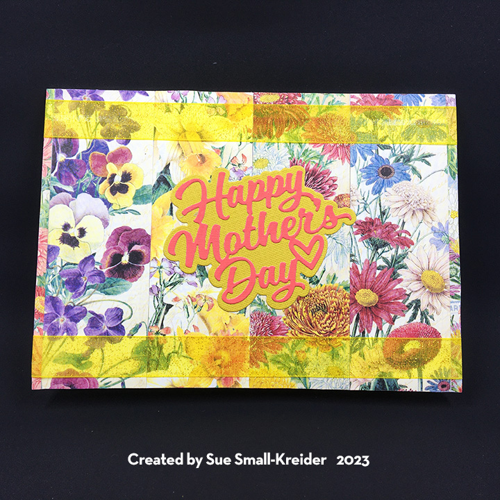
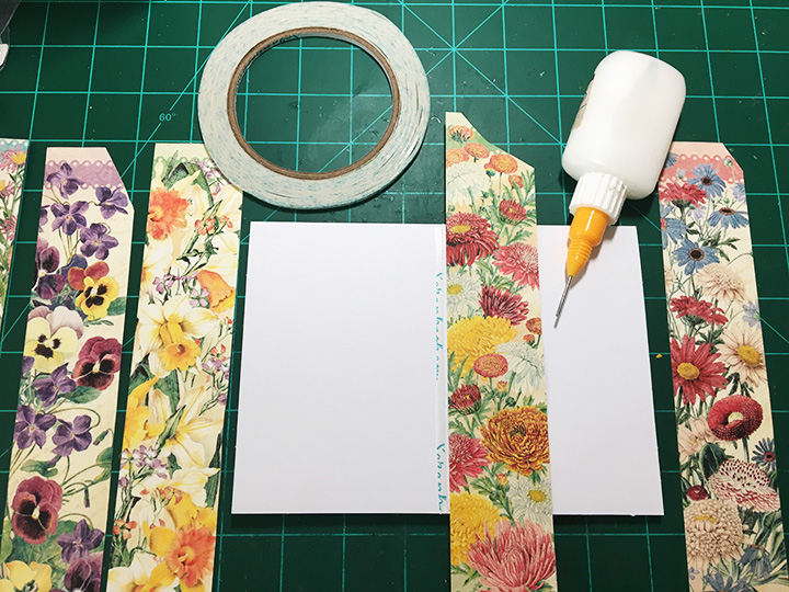
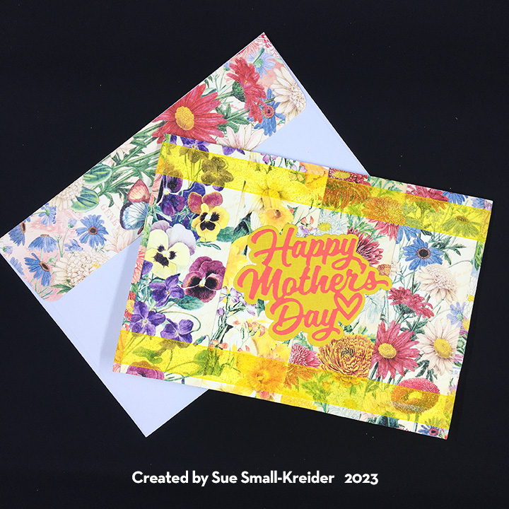
I began by looking through my paper stash and settled on a Graphic 45 paper collection that featured flowers of the months.  Karen Burniston’s Waterfall Card dies made it easy to create four different waterfall panels. It was the backgrounds panels for the card that were a bit more difficult since I had already cut into the papers for other projects. I ended up piecing together stripes of the flowers from the various months needed for the front of the card and a patchwork for the inside top panel. For the inside bottom panel that the waterfall rests on, I made stripes of the ribbon from the various flower papers. The card back is a whole piece of flowered cardstock.

Having reviewed the waterfall assembly video, I knew that a 5×7 (A7 size) card base with a top fold could accommodate the waterfall. For the hidden message of “love you,” I used the words from Karen Burniston’s Words Set 13 to die-cut into the decorative panel that goes to the pull strip. The background papers had all been adhered to the purchased card base when I die cut the finger semi-circle into the card base bottom panel. Having assembled the waterfall mechanism, I then stapled it onto the card base as shown in the assembly video.

For the customization of the names and birthdays, I used the postage stamp ephemera pieces from the paper collection for the month and then added the names and dates using Karen Burniston’s Mini Alphabet and Numbers die set.

Card Back

Ribbon can hide a multiple of small mistakes and liven up a card. On this card it softens the staples on the back of the card and brightens up the card front. The front sentiment is Karen Burniston’s “Happy Mother’s Day” which includes a shadow background die in the set. The white label inside can be used for a personal message and is cut using the largest of the fancy labels in the Crosshatch Rectangles and Labels die set.

The envelope uses more of the flowered paper for the back flap.

Materials Used:

Dies

Papers

  • Graphic 45 – 12×12 Double-Sided Paper – Flower Market Collection
  • DCWV – Textured Cardstock Stack 12×12 – Brights
  • Black Cardstock
  • Park Lane Paperie – A7 Card Base and Envelope – White

Pens

  • Pigma Micronn – Archival Ink – 01 Tip – Black
  • Sharpie – Permanent Marker -Ultra Fine Point – Black

Adhesives

Tools

Miscellaneous

  • Yellow Organza 3/4-Inch Wide Ribbon

Mother’s Day Flower Cart Pop-Up Card

Flowers for Mother’s Day is traditional. A pop-up flower cart just adds to the fun.

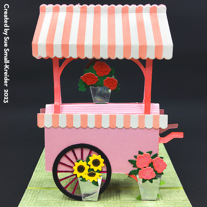
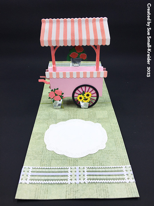
This card uses Karen Burniston’s pop-stand mechanism die to make the market cart builder dies by Honey Bee Stamps really stand-up in an otherwise flat card.

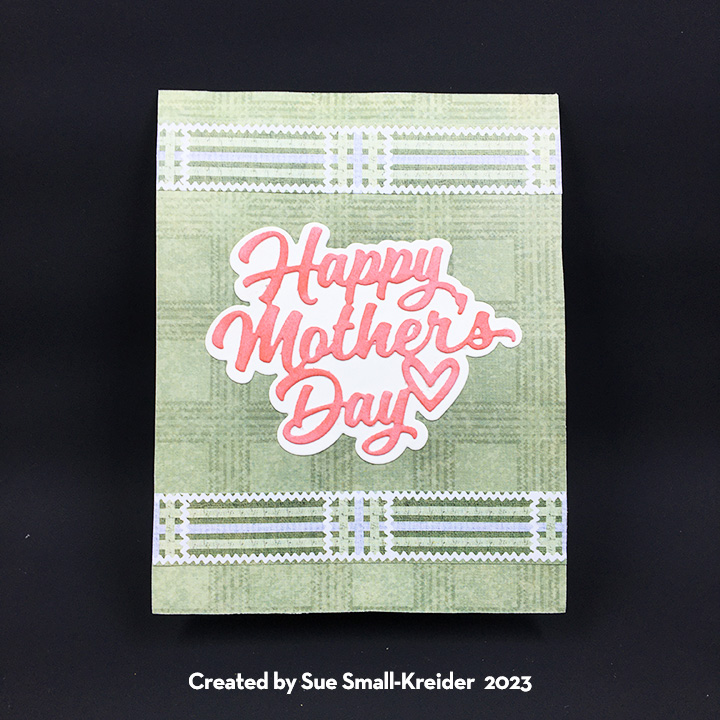
Card Base:  I watched a variety of videos on how to use the market cart dies as well as the assembly video for the Christmas Trees Pop Stand before I decided on an A2 (5 ½ x 4 1/4-inch) top fold card base. The inside of the cardbase was blended with green and black inks over the fold and then covered with two panels of green printed paper. I used the cart die to mark where the two pop-stands needed to be and die-cut them one at a time. I then covered the four holes created in the card base with small scrapes of the green paper adhered to the back of the card base. Finally, I covered the outside of the card base with green paper.

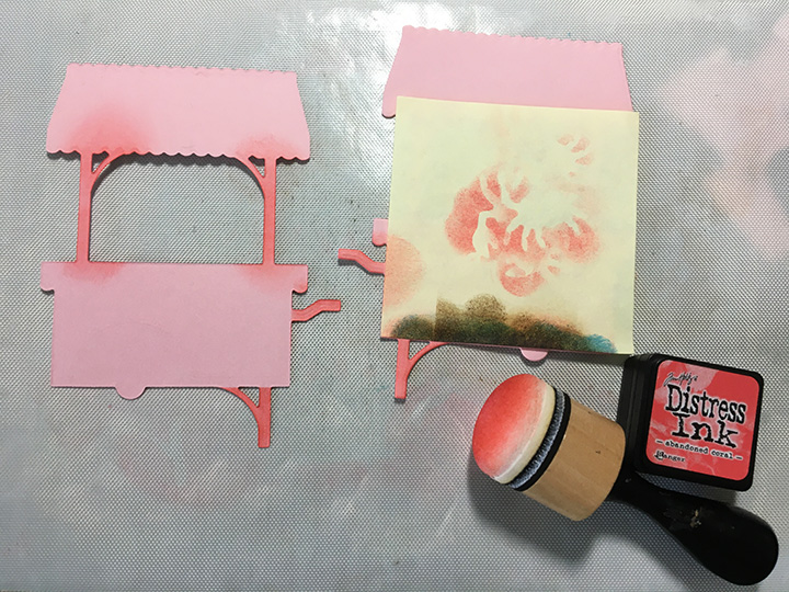
Cart:  I cut two of all the cart pieces – wheels in black and a pink foil, cart base and shelf from a heavy pink cardstock, roof and cart trim from lightweight cream cardstock. There is a coordinating stencil for the roof and cart trim stripes which I used with a bright pink ink and sponger tool. The same ink was also used on the cart’s handles and posts. The two shelf pieces were glued one on top the other so that the tabs were on both sides. Taking one of the cart base pieces, I turned it over and glued a wheel, trim piece and the top edge of the roof onto the cart base. Under the roof I placed three foam squares to add dimension to the roof. I repeated the adhering of cart pieces on to the other cart base’s front side. The shelf piece was folded in half along the slot line and then glued to the back sides of the cart base pieces making sure the cart pieces all lined up when pressed flat. The top edge of the roofs was glued next. Finally, the pop-stand tabs were glued to the back of the cart’s two legs and two wheels.

Flowers:  Cutting two sets of the three kinds of flowers and leaves from colored cardstock scraps, I used markers and gel pens to color the embossing of the wee flowers. The edges of the leaves were inked with black. The six pails were cut from some silver holographic junk mail scrap. A Quickstik or pick-up tool is very useful when assembling these flowers. An inch long strip of cardstock was stuck through the fold in the cart shelf and glued to the shelf underside. The two rose pails were glued on either side of the strip. The other flower pails were glued to the cart legs and wheels to cover up the pop-stand tabs.

Sentiment and Labels:Happy Mother’s Day” is a die cut sentiment that comes with a shadow die. Both pieces were cut from cream cardstock. The sentiment was inked with bright pink ink before being glued to the shadow piece. Labels were cut from cream and pink cardstock using the dies in the Crosshatch Rectangles and Labels die set.

Decorations: I used the green paper’s decorative borders to create fence-like borders on the card front and inside, as well as using smaller snips of the border on the card back and envelope. The envelope and card back snips have a heart drawn with a black gel pen.

See other flower stand cards:

Thank you for reading this blog post. I hope this inspires you and makes you smile. Please like and leave comments 😊

Materials Used:

Dies

Stencils

  • Honey Bee Stamps – Coordinating stencil -Market Cart -HBSL-085

Papers

  • Hot Off The Press – 12×12 Single-Sided Paper -Apple Green
  • Bazzill – 8.5×11 Heavy Cardstock – Cotton Candy
  • Bazzill – 12×12 Heavy Cardstock – Travertine
  • Black, Red and Cream Cardstock Scraps
  • A2 Green Envelope

Ink

  • Ranger – Tim Holtz – Distress Ink- Abandon Coral, Mowed Lawn and Black Soot
  • Sharpie -Permanent marker- Ultra Fine Tip -Racey Red
  • Gel Pen – Hot Pink and Black
  • Pigma Micron – 05 – Brown

Adhesives

Tools

Rainbow Flowers Birthday

April showers bring May flowers and this birthday card delivers on a rainbow of colorful wishes and flowers.

This pop-up twist and pivot card features dies by Karen Burniston and papers by Honey Bee Stamps. A white cardstock rectangle of 10 x 6 3/8-inches folded in half was used to create a 5 x 6 3/8- inches top-fold cardbase.

To create the twist and pivot panels, I first watched several assembly videos to understand how to combine the two mechanical mechanisms. (The flower and train pivot panels are similar and the directions for adding the pivot panels to the twist panel pop-up starts about two-thirds through in this assembly video. The assembly video for the Twist Panel Pop-up is here towards the bottom of the page.)

Pop-Up Panels: Because I was limited to using paper from a single 6×6-inch paper pad, I found that the largest die was the flower pivot panel which had to be cut diagonally from the square of double-sided paper. Once this was cut, all other pieces had to be cut based off the direction of the stripes. Two dotted 6×6 squares were joined together with clear removable tape on their backsides and die-cut using the X mechanism die from the twist panel pop-up set.  I used the excess strip of 1-inch cut from both the square dot panels to fill-in the holes where the mechanism folds up. Next, I glued the dotted panels into the card base with the clear tape joint going into the fold. The arms of the mechanism were die-cut from purple and glued to the X mechanism.

Flowers: There are dies in the flower pivot panel that can create three different large flower heads and one smaller flower. I created six of the white daisy, three of the yellow flower, three of the red flower, four of the purple flower and one small purple flower with leaves. I attached the two panels die-cut from the twist panel set to the flower pivot panel as shown in the assembly video. Decorating all the panels when they are flat is the easiest. Once decorated, attach panels as directed in the twist panel assembly video.

Decorations: The card front and back panels were covered with single sheets of patterned paper. The front features rain and clouds cut from the back of the double-sided paper while the back features a stained glass effect sunset. Grass edging was cut from the excess green strip cut from the back panel paper and used with the extra flowers to decorate the front and back of the card.

Sentiments: A large shadowed “Happy Birthday” was die cut from red and yellow to standout on the dark front. Stamped Funny Bones sentiments from Riley and Company grace the inside of the card and the envelope’s back flap.

Envelope: The tiny purple flower with leaves finishes the envelope flap. The card fits into an A7 envelope.

Thank you for reading this blog post. I hope this inspires you and makes you smile. Please like and leave comments 😊

Materials Used:

Dies

Stamps

  • Riley & Company – Funny Bones – A Year Older-RWD-1144
  • Riley & Company – Funny Bones – This Is An Annual Reminder -RWD-1142

Papers

  • Honey Bee Stamps -6×6 Double-Sided Cardstock Pad- Over the Rainbow
  • White cardstock 10 x 6 3/8-inches
  • A7 white Envelope

Ink

  • Simon Says Stamp – Premium Dye Ink – Slate

Adhesives

Tools

  • Die Cutting Machine
  • Stamping Platform
  • LDRS – Stampendable Stamping Tool
  • Stamping Cloth
  • Ruler
  • Scissors
  • Pencil

A Strawberry Loving Friend

This card was made for Craft Roulette #159 whose parameters included a card type of my choice (5×7 pop-up), strawberry fields colors, plaid or gingham and a chair. It has a conservatory or fancy potting shed feel to it.

Karen Burniston’s Adirondack Chair die set is the basis for this pop-up card that uses a slipcover to convert it into an overstuffed chair. (See this video for technique.) I made a template that I can used to quickly create the slipcover.

First I glue strips of paper to the from of the legs and then glue the arms on pushing down the over hang tips to form the rounded arm fronts. Glue the slip cover to the chair base.

The plants are die cut from the Garden Charms set while the dog is from the Doghouse die set. All are popped-up using cubes made from strips of matching cardstock. The tiny bright strawberries are clay shaker elements adhered with dots of glue.

I like being able to use one paper collection for an entire card for coordinating colors and designs. The Graphic 45 Fruits & Flora set was perfect for this in the 8×8-inch size. It had journaling tags and border that were just the right scale for this card and envelope flap.

For more chair and seating blog posts click here.

Thank you for reading this blog post. I hope this inspires you and makes you smile. Please like and leave comments 😊

Materials Used:

Dies

Papers

  • Graphic 45 – 8×8 Double-Sided Paper – Fruit & Flora Collection
  • Terra Cotta and Green Cardstock
  • Paper Lane Paperie – A7 Cardbase and Envelope – White

Inks

Adhesives

Tools

  • Die Cutting Machine
  • Scissors

Miscellaneous

  • Dress My Craft – Clay Shaker Elements – Strawberry Slices

A Poppin’ Birthday Card From Cats

A Poppin’ Birthday Card From Cats

Every so often, I get a commission’s from cats for cards for their human family. This card was a birthday card for their cat mom.

My inspiration for the card is from the stamped image on the back of the card by Dominic Phillips called Bad Cats Club which has a preciously stacked set of wooden crates with cats perched on them. (I also drew engineering inspiration from Karen Burniston’s March 4, 2023 virtual class for the stacked cubes.) To recreate this image in a 3D form, I used Karen Burniston’s Surprise Cube Pop-Up and Bam-Box Pop-Up dies and cats cut from paper and washi tape. The card is a gusseted slimline card with string wrapped closure.

Card Base: Because I was using specialty cardstocks that were 5 1/2 x 8 1/2-inches, I cut two 3 3/4 x 8 1/2-inches pieces and one gusset strip of 3/4×8 1/2-inches. The gusset strip was scored and folded lengthwise at 1/4-inch and 1/2-inch. The 1/4-inch tabs on the gusset strip were glued to the long backsides of the bronze metallic piece and woodgrain piece. Next, I worked on the flap closure. The inside of the card base is covered with a wide map pattern washi tape.

Flap: I watched the assembly video for the Long Flap and Closure before I began the flap assembly. A long flap and six spacers were cut from brown cardstock using Karen Burniston’s Long Flap and Closure die set. A decorative flap inset piece was cut from the woodgrain cardstock and another for the inside of the flap from brown cardstock. I used two long brass brads that I had to trim the legs to make them fit the card using metal cutting snips. The star decorative piece under the brads is from the Surprise Cube Pop-Up and pushed up from the cardbase by three spacers glued together. (Remember to think through the assembly of the card so that you have papers to cover over the brad legs. Also remember to add your string before covering the brad legs with a decorative paper.)

Tower of Crates: For the pop-up cubes I watched the Surprise Cube assembly video and Bam Box assembly video before starting. From discussion with Karen Burniston on her Pop-Up Peeps Facebook page, I learned that as long as the cubes would fit into the cardbase when folded flat, you could glue the cubes in any manner. (Let the glue set-up before you test your cube tower opening….I had to glue my tower a few times because I was impatient and the power of three rubber bands was pretty strong.) I cut the decorative woodgrain papers from scraps I had in my stash. The cats were fussy cut from some printed papers in my stash and from some washi tape. The top cat is glued to a Bam Box which is glued to the top cube. (I attached the tower with a brad through the bottom cube and card base, much like you would for a ball pop-up animal that you want to be able to turn.)

Sentiments: I used the Happy Birthday die set by Karen Burniston and the paw prints from the Doghouse Tiny House Add-ons for the inside sentiments. The stamped sentiments outside came from the Bad Cats Club set and a Happy Meowther’s Day set.

This card will be delivered in person, so no envelope was created for it.

Thank you for reading this blog post. I hope this gives you inspiration and makes you smile. Please like and leave comments 😊

Materials Used:

Dies

Stamps

  • AALL & CREATE – Designed by Dominic Phillips – Bad Cats Club – #793
  • Simon Says Stamp – Clear Stamps – Happy Meowther’s Day – sss202293c

Papers

Ink

  • Stampin’ Up – Classic Stampin’ Pad – Early Espresso

Adhesives

Tools

  • Die Cutting Machine
  • Scoring Board and Tool
  • Stamping Platform
  • Scissors
  • Piercing Tool
  • Metal Cutting Snips
  • Small Crafting Clips

Miscellaneous

  • #8 Rubber Bands
  • Fun Stampers Journey – Journey Thread – Beach Breeze
  • Washi Tape – Old Maps – 2 3/8-Inches Wide
  • Washi Tape – Cat Life – 1 3/8-Inches Wide