Be Adventurous!

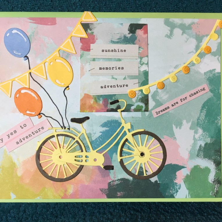
IMG_5828Say yes to adventure. Chase your dreams.  Who knows where it will lead you?  This is a card that tries to capture all these sentiments and to celebrate achievement.

The inspiration for this card comes a desire to use all of my bicycle dies, but morphed into a card trying to only use one paper set (Chasing Dreams by Maggie Holmes for Crate Paper). The bicycle die set is by Simon Says Stamp and has the wheel as a separate die so you can cut the perfect tire from a separate color and has a separate basket die as well. The balloons, string of lights and banner flags are from one of my favorite die sets by Sizzix and Courtney Chilson. A fine tipped black marker was used to color the bike’s handles, pedals and balloon strings. A white gel pen was used to color in the balloons’ highlights.

IMG_5829

While the outside of the card is to suggest the current moment, the inside is to suggest how pleasant the future will be if you chase your dreams and say yes to adventure.

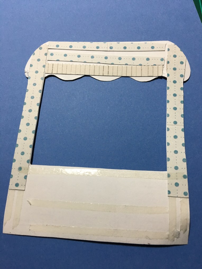
All of the pop-up, stamped, watercolored and die cut images come from the Hero Arts January 2019 My Monthly Hero kit. I had to cut off the top awning of the flower stand and lower it to fit inside the card.  I reinforced the back side of the stand with strips of scrap paper before attaching with double-sided tape.
IMG_5815

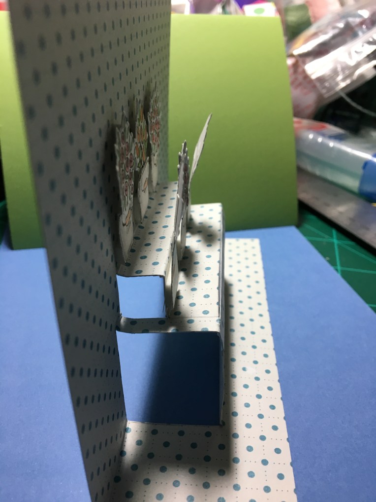
The tiered stand was inspired by a tiered pop up cake by Karen Burniston for Elizabeth Craft Designs. Since the die is no longer available, I had to improvise to create the right proportional shelves.
IMG_5816

The outside sentiments come from the paper stack while the inside sentiments are from two separate sets.  The “you’re wonderful” is stamped and embossed from the Hero Arts set and the ”Celebrate” is die-cut from Momenta Firefly’s Celebrate Happy Birthday die set.


SUPPLIES USED:

Dies


Stamps:

Paper:

Miscellaneous:

Potted Flowers Greetings

IMG_5805

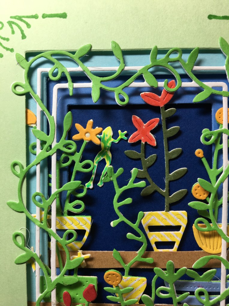
A colorful archway of potted plants looking into shaded shelves of plants. What could be more inviting on a hot summer’s day than the cool retreat into a shaded, colorful paradise?

The shadow frames were die cut using the three rectangles from Sizzix’s Courtney Chilston’s Birthday Shadow Box Thinlits set from a set of blue cardstock that progressively gets darker as it goes backwards, just as the light and shades would looking through a doorway on a sunny day.

IMG_5807

This card was created using Poppy Stamps’ Spring Pots Shelves, Spring Pots Frame and Tiny Frogs dies. Two full die cuts were made from each of the pots dies – one in white/cream cardstock and one in green. The green die cuts had the rectangular frame cut away from the vine on the frame and the green shelves had the two shelves separated.  Using colorful scrapes, additional dies cuts were made of pots and flower blooms.  (Hint: Use wax paper over these intricate dies. They will peel off from the back side of the cardstock and take many of the tiny dots and squiggles with them as you peel. Use a poking tool for the rest.)

IMG_5806

The green die cuts were glued onto the white/cream die cuts and the colorful pots and blooms were glued down.  Using some scrap brown kraft-paper, two narrow strips were cut and glued over the separated pots to form two new shelves that were a quarter of an inch longer on each side.

Stampin’ Up’s “Hello There” stamp and coordinating corner stamp complete the front of the card.  (I suggest stamping first before assembling the card.)  The inside sentiment is die cut from a Karen Burniston Word set.

IMG_5804

Foam tape was used between the four layers placing the tape near the cut out rectangle so that foam layers are not directly above each other so that the card will meet the .25” maximum thickness of U.S. Postal Service.

IMG_5803

SUPPLIES USED:

Dies

Poppy Stamps 2174-Spring Pots Shelves

Poppy Stamps 2173 Spring Pots Frame

Poppy Stamps 1781 Tiny Frogs

Sizzix 663581 Courtney Chilston’s Birthday Shadow Box

Karen Burniston in cahoots with Riley & Co. 1002 Word Set 1- Greetings


Stamps:

Stampin’Up 147464 Around The Corner


Miscellaneous:

Wax Paper

Scotch Foam Tape

Tombow Aqua Mono Liquid Glue

Crayola Signature Brush & Detail Dual-ended Markers

Paris in Springtime

IMG_5767IMG_5742

What a romantic image of Paris !  When I received the two dies that I used on this card, I looked at the packaging images for ideas for colors and layout and then did some modification to the easel mechanism.

IMG_5763

Changing the frame from a hanging charm to a larger flat panel on an easel was as simple as using ½ inch wide, red-sticky-permanent double-sided tape to hold in place the rectangle piece that was cut out for the frame.  And adhering the flat panel to the easel.

57797289798__0923E463-C45B-4C12-95BB-A64D3D2307D1

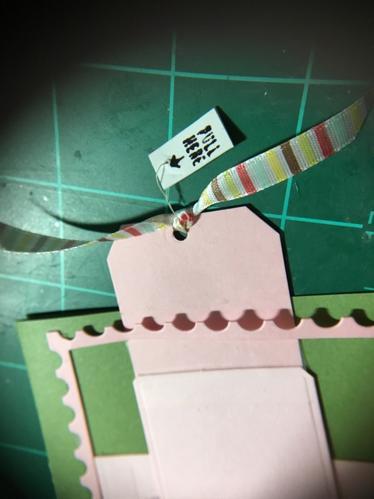
Because the flat panel is larger than the original frame pull tab, I had to add an extension tab. I used clear removable tape to smooth over the catching point where the extension level changes. In order to be able to fit the card in an A2 envelope, I punched a hole and tied a ribbon to the tab as a pull grip.

Pull Here

But how does the card recipient know to pull the ribbon?  Read my last post on CRX.

IMG_5767

Paris Easel Card

Paris in the Springtime Die set from Die Cutting essentials  issue 49

Karen Burniston’s Pop It Ups for Elizabeth Craft Designs 1104-Hanging Charm Pull Tab die set

“Pull Here” stamp from Concord and Ninth’s Mail Drop Stamp Collection


CRX – Card Recipient Experience

You create the most delightful card that moves went you pull a slider or you create a box card that folds flat, and the recipient of the card gets it in the mail and has no idea how to make it work.  This is not the ideal card recipient experience (CRX) you want.

In the web designers world, they talk about User Experience (UX). For us in the not so digital field of card designers, we need to think about CRX or how we let our users know how to operate the card if the recipient is not use to receiving interactive cards.

Arrows indicating direction to pull a slider tab are common.  Including a diagram of how a box card should look when completed is simple enough. Or you can get creative and string a “pull here” tag on a thread that can be removed once used.

A great card is both beautiful to the eye of the beholder and easily explained if it involves moving parts.

Dies/Stamps Used:

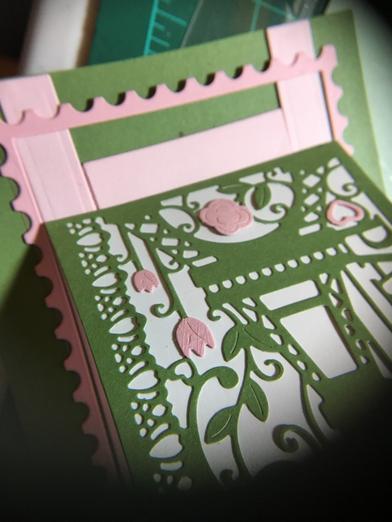
You’re In My Thoughts Box of Flowers

Lawn Fawn Scalloped Box Card Pop-Up

Build -A-Bouquet Stamp Collection for Papercrafter magazine issue 118 

Stamped in black ink and colored with Crayola Signature Brush & Detail Dual-ended Markers

Tea and Tulips Box of Flowers

Lawn Fawn Scalloped Box Card Pop-Up

Stampin’ Up’s Tearoom Copper Vinyl Stickers

Stampin’ Up’s Tea Room Specialty Designer Series Paper

Tea Room Memories & More Card Pack.

Shaded Tulip Stamp & Layer set by Susan Bates for Papercraft Inspirations magazine, issue 182

CraftSmart and Hampton Art mini ink pads.

Paris Easel Card

Paris in the Springtime Die set from Die Cutting essentials  issue 49

Karen Burniston’s Pop It Ups for Elizabeth Craft Designs 1104-Hanging Charm Pull Tab die set

“Pull Here” stamp from Concord and Ninth’s Mail Drop Stamp Collection

Two Fish, One Fish

Fish bowl 4

Two fish, one fish, is that a cat I see?

This is meant as a fun card. Ever since I saw the Die-cutting essentials magazine issue 36 Underwater Friends die set, I have been planning to make some sort of interactive card with it.

Fish bowl 2 - Copy

Finding the Karen Burniston Pop It Ups’ Oval landscape Accordion -1108 die set by Elizabeth Craft Designs gave me the idea on how to proceed to tell a story through a card.

Fish bowl 1 - Copy

First there are two fish. Then there is one fish. then there is a cat’s face watching intently.

Fish bowl 5 - Copy

Did the cat do anything beyond watching? What do you think happened?

Fishbowl-envelope

The cat’s face has a slit at the top and bottom so that it can slip off the pivot points and be signed or a greeting added.  I used Grafix Dura-Lar .005 Clear Film, an archival polyester film to die cut 3 of the accordion sections. I then die cut 6 of the blue cardstock accordion sections and then all the fish and greenery pieces. I used a combination of Tombow Aqua Mono Liquid Glue for around the blue oval frames because I could easily clean-up any messes with a damp paper towel. I used Tombow Multi Mono Liquid Glue for adhering the blue frames to the clear film because it needed to be a strong adherence for a sturdy frame.


Roses and Apple Blossoms for Mother

Flowers on Mother’s Day is a time-honored tradition. When combined with the new washi tape petals and leaves and craft papers from the Victoria & Albert Museum in London this Mother’s Day card is nostalgic.

The pop-up mechanism inside is made with Karen Burniston for Sizzix Platform, Circle & Ribbon 3-D Bigz die. The washi tape petals feel like real pressed flowers, so I decided to make it look like a pressed apple blossom complete with yellow sewing thread stamen.
I used a variety of double-sided tape to adhere the layers and Tombow aqua mono liquid glue to put the inside mechanism together. Foam tape was used to attach the sentiment doily which was cut out using the pop-up gatefold die from Papercraft inspirations issue 188.


Envelope Mothers Day card

I had been watching the PBS show Victoria and reading up on the show’s newsletter on-line and for once the pop-up ads had something, I might not have found otherwise – the V&A Collection of paper crafts. The V&A is the Victoria and Albert Museum in London which has one of the best textiles and graphics collections in the world for the 19thand early 20thcenturies. I purchased my supplies from Hobbycraft, but there are other UK suppliers of the collection.
Envelope was stamped with Hampton Arts ink pad and Inkadinkado 60-30380 Modern Flower Flourish stamp

Cat in the Window

IMG_5625

Cats pop-up everywhere and this card is no exception. The inspiration for this card comes from Juliet and Romeo the two cats who live with the recipient of this card.  The overstuffed chair is one that has been passed down in her family and a favorite of Romeo to curl up and sleep.

IMG_5621The chair is made from Karen Burniston’s 1071-Adirondack Chair with a custom fit slipcover cut from paper inside a large business envelop. The round blue pillow is cut from the front of the envelope and adhered to chair with foam tape. Romeo’s picture was supplied by his human companion and has a tab running thru the chair and attached to the floor. The afghan throw is from Echo Park’s A Perfect Summer by Lori Whitlock and is also attached to chair with foam tape. Wallpaper is from Colorbők’s Brights Photo Mats. The flooring is from Ms. Sparkle & Co. Paperie’s Woodgrain Neutral paper pad. The “Happy Birthday” was cut from black cardstock using Momenta Firefly’s Celebrate Happy Birthday die set 35516 R7. The floorboard molding on wallpaper was a scrap piece of white cardstock scored at the top and bottom edge.

IMG_5615

Front of card has Juliet looking out a window. The window, shutters, flowers and flowerbox are from Poppy Stamps Small Madison Window set no. 1137 and decorated with white gel pen. The window glass is cut from the glassine window of the large business envelope that was upcycled to slipcover chair.  The cat is cut from white cardstock using Karen Burniston’s 1024 – Cat die and then ink blended to get Juliet’s wolf-like grey fur. The “popping up to say” lettering comes from Karen Burniston’s 1027-Word Set 4- Just a Note. The letters were dotted with a black fine point felt tip pen.

See more chair cards below:

Other supplies used:

Stampin’ Up Cards – Sympathy

Sympathy-2

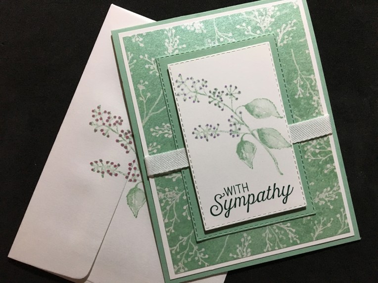
I went to a workshop this past week with Donna Butler, a Stampin’ Up demonstrator.       I really enjoyed learning more about the proper way to stamp. And, I loved the feel of the cling stamps. They were soft and required a lighter touch than some of the clear polymer stamps I have been using.

Here is one of the cards we made using a design of Donna’s. Note that each of her cards are designed with an interior panel that can be removed if the card needs to be repurposed.

Sympathy inside

Donna’s list of supplies:

Stamp sets:

Cardstock:

Inks:

Blends:

Accessories:

It’s Baseball Season

IMG_4951

I have a Coach K in my life who has coach hundreds of young men to excel in the game of baseball from Little League through high school teams.  His baseball hero is Roberto Clemente. So when I saw the Carta Bella Paper’s Baseball series I immediately thought of Coach K.IMG_4945

I made an A2 size card with a fold-out shadow box inside including a dangling baseball made from two plastic baseball embellishment stickers stuck together encasing the thread. The batter was cut out as a rectangle with strips add to the sides to adhere using double-sided tape.  A circle die was used to cut the hole for the shadow box.

IMG_4946

I used the scoreboard card for the background of the batter. The Home Run hotdogs sign became the ads you often see around the fences and walls of baseball stadiums. The happy birthday sign was computer generated to match the style of the cards.

The concept of the open center box card was inspired by a MayMay Made it you tube video.